There was little news by way of the Federal Reserve during the month. The statement released on the final day of April announced the largely expected tapering of another $10B per month of bond purchases. The Fed is now buying $45B per month of long-term U.S. treasuries and mortgage-backed securities. What will be interesting in coming months is the “measured” manner in which Fed policy makers decide to unwind bond purchases. Simple math dictates that a reduction of $10B per month will leave a $5B stub at the end of the program (hardly worth doing), so we wonder if tapering might be accelerated to $15B per month starting at the June FOMC meeting. This route would mean 3 more purchase reductions in even amounts, to conclude at the September FOMC meeting. Perhaps the minutes from the April meeting to be released on Wednesday, May 21st will shed some light on whether the Fed has considered this avenue.
Turning to the economy, March non-farm payrolls came in at +192K versus expectations for +195K, January payrolls were again revised higher to +144K (from +129K on the 2nd estimate), and February was revised to +197K (from +175K), for a net revision of +37K jobs. The unemployment rate (U3) held steady at 6.7% and the labor force participation rate ticked up to 63.2% from 63.0% last month. The first estimate of Q1 2014 GDP came in at an abysmal +0.1%, which is largely being attributed to the frigid winter in the U.S.
April was a relatively tame month for most leading stocks. After sharp selloffs in March, most leaders (i.e. those with the best fundamentals– EPS growth, sales growth, high ROE’s, etc.– and the best technical action– price moves higher in stronger volume, support at key moving averages, etc.) are off an average of 20-25% from their highs. This action could indicative of either something bigger on the horizon for the broader markets, or just an especially sharp correction for the best-acting stocks in the market. As of April’s close, many of these leaders were having difficulty getting traction and rebounding sharply from their lows. This hints to us that the correction could be signaling a larger correction or even bear market could be looming in the coming months.
This month, as we have every month since August 2012, we’ll break our market analysis down into our 4 pillars of market health: 1) The action of the indexes, 2) The action of the best leading stocks, 3) Sentiment & Psychology-based indicators, and 4) Historical precedent action. Remember that Thomas and I place the most weight on pillars 1 and 2 (our primary measures of market health) when performing our analysis. Pillars 3 and 4 are important, but are secondary indicators in nature and need to be treated as such.
I’m going to dive right into analysis under the assumption that readers of this commentary have read our previous installments and have developed a basic understanding of our approach to the market. For first time readers, I recommend reviewing our February 2013 Commentary and earlier to ascertain a detailed explanation of why we at Satellite Capital examine what we do, and why we are interested in certain stocks over others. And as always, please don’t hesitate to contact Thomas or I with any questions.
Indexes
For the month of April, the Nasdaq fell 2.0%, the S&P 500 climbed 0.6%, and the NYSE Composite rose 0.9%. As mentioned in the introduction, the Nasdaq and Russell 2000 continued their divergence from the NYSE, S&P 500, and Dow Industrials in April. While the Nasdaq and Russell treaded lower and kissed their rising 200-day moving averages, the other 3 large cap indexes have held near high ground, though had not moved into it by April’s close. While a divergence of this extent by the indexes is unsettling, the market has a way of snapping back in sync rather quickly after these divergences (usually within 3 months).
Revisiting some commentary from last month, the action of the Dow Utilities often precedes that of the broader market. On the very last day of April (the same day the Fed released the statement from its April policy meeting), the Dow Utilities had a downside reversal, closing at the lows for the day in big volume. While not an indication of what’s to come on its own, reversals of this type have marked the top of every Utility index move over the last year. If the Utilities were to head lower over the next 1-2 weeks, a move of that nature could provide advance insight into how the broader averages may act over the next 1-2 months. It’s also worth noting that prior to reversing, the Utility average set an all-time high on the very last day of the month.
In summary, the stark divergence between small caps and large caps that increased during the month is worrisome. As of April’s close, it appears the Nasdaq and the Russell are trying to mount a fresh rally after bouncing off their 200-day moving averages, the Nasdaq having even undercut its prior low from February 5th. We should again be cautious not to allow new highs on the large cap indices to suck us back into the market too soon. At this point, only a strong confirmation by the Nasdaq, the Russell, or ideally both would justify increased long exposure after a fall of this magnitude. And waiting for the indexes to get back in sync (either via the Dow/S&P/NYSE falling and undercutting their early February lows, or via the Nasdaq and Russell climbing into new high ground) should offer more conviction about the market’s future direction. As of the end of April, defense continues to be the best play going into May. These divergences will likely sort themselves out soon.
Leading Stocks
April was another month to forget for leading stocks. While the indexes headed lower through Tax Day (April 15th), most leaders followed suit and did the same. Despite most of the real damage to leaders having been inflicted in March, April was still damaging to quite a few stocks. The breadth of leadership has certainly narrowed from where it stood at the beginning of February, before the last strong advance. Almost 2/3 to 3/4 of the prior leaders have suffered fairly deep corrections of 20-30% (or more). There remain a handful of stocks that have been able to weather the storm, which indicates to us that the leadership baton has merely been passed for now, and that the market is likely to regain its footing at some point in the coming months. In the meantime, we could experience quite a bit more volatility.
Among the few stocks that appear to be holding up well: AAL, ARRS, AVGO, KORS, MU, SWKS, TRN, URI, & Z. This is not to take away from our statement last month that Facebook (FB) and Tesla Motors (TSLA) are the true market leader and momentum market leader respectively. Both these stocks still need to be watched closely for indications of what could come next. With leadership narrowing, an investor’s best bet is to focus on those stocks that continue to perform best relative to the pack, and to keep in mind that the overall environment is much more fragile than it was just 2 months ago.
Overall, while the indexes appear to be mounting a rebound rally from their 4/15 lows, we haven’t yet received a confirmation signal that it’s okay to buy leading stocks. The longer this limbo continues without a suitable confirmation signal, the more likely the trend will return lower very soon. The current leader action is somewhat reminiscent of May-June 2010, when stocks meandered higher and tried to breakout, but were ultimately hit hard in the final days of June. If an investor does enter long positions in this environment, he or she would be encouraged to keep positions small and on a very tight leash.
Sentiment & Psychology
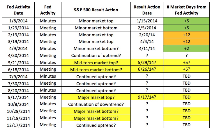
To continue the theme of this section set in prior months, I’ve updated our Fed Activity study below with new information gleaned last month: The market (as measured by the S&P 500) hit a short-term peak on 4/4/14, dropped for a week in an A-B-C jigsaw fashion, and bottomed on 4/11/14. This marks a +12 on our Fed activity study, indicating to us that the move was part of the larger trend. Key market-moving Fed activity generally results in market reciprocation within 5 days of said Fed activity. It should be interesting to watch what happens in May upon either the Fed meeting (held 4/30/14) or the minutes release on 5/21/14. We’ll continue tracking this throughout the year to demonstrate just how much influence the Federal Reserve has on U.S. equity markets. If you have questions on this study, please refer to our prior commentaries to understand exactly why we’re analyzing this information.
The Nasdaq Advance/Decline line continued to move lower through the last days of April. This stands in stark contrast to the action exhibited by the NYSE A/D line, which continues to plug to new high ground. Breadth is clearly stronger on the larger, more established companies (as listed in the S&P 500). We’ll continue to monitor this trend to see if (or more likely, when) the NYSE/S&P decliners start to outnumber advancers. Such a reversal could be a hint of an important change in trend.
Overall, measures of sentiment & psychology are secondary in nature to actual index and stock behavior. We can use these measures to help us gauge the risk/reward relationship in a given market environment, but the action of our stocks as they relate to the that of the broader indexes is the best guide to help us allocate this ratio. While our investment roadmap can also help us assess prospective return scenarios, the actual activity of indexes and leading stocks remains our primary cue.
History & Precedent
This month for History & Precedent, we’ll compare today’s market action on the Nasdaq with that from the summer of 2010. Keep in mind that this type of analysis remains secondary in nature to daily index analysis and that of leading stocks. However, finding and studying historical periods that resemble current market action can help us identify and understand recurrent themes in our current environment.
On the chart below, I’ve drawn a common pattern technical analysts use to help identify both topping and bottoming action. In the examples that follow, I’ll demonstrate how this “Head & Shoulders” pattern could have helped an investor identify topping action on the Nasdaq during the 2nd quarter of 2010 (4/26/10-7/1/10).
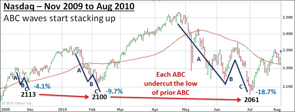
Also on the chart below are calculations to estimate how deep a Head & Shoulders top could fall. We start by drawing the neckline (which can be somewhat subjective), then measuring the difference between the index peak (2535 in this example) to the neckline (which was approximately 2250). The difference was 285 points. We then go to the point during the selloff at which the neckline is officially breached, which happened at 2295 on our example below. Finally, we take the breach point on the neckline minus the difference calculated above to get a price target of 2010. For the total correction, the Nasdaq’s low was 2061, within 2.5% of the wave estimate. The clear signal to close any short positions would have been about the time the index breached its prior 2139 low, as we’ll demonstrate on the chart that follows.
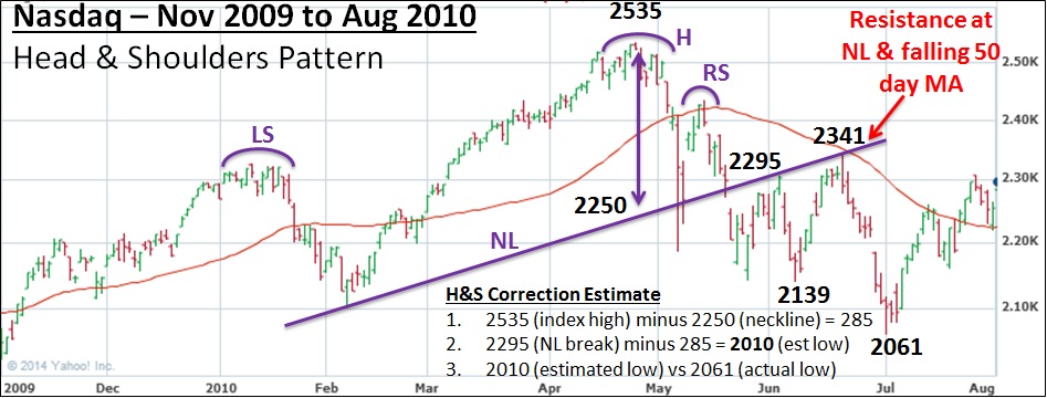
As you can see above, a clear H&S pattern predicted a low for the selloff of 2010, which was fairly close to the 2061 actual low for the move. It’s also important to note that the index found resistance on the bottom side of the neckline on 2 separate occasions (2295 & 2341). These tests served to draw in the maximum number of investors before the eventual reversal in direction.
Now turning to Elliott Waves (a mainstay of this section in prior months), one key tenet is that a down-trending wave in an overall uptrend unfolds in A-B-C fashion. Also of note for this wave is the proclivity of the index to contain a smaller 5-wave pattern within the Down A wave. On the chart below, I’ve marked up these waves for the 2010 Nasdaq correction. You can see a clear 1-2-3-4-5 in Down A, followed by an Up B and a final, sharp selloff in Down C.
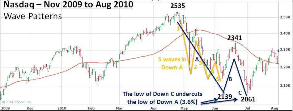
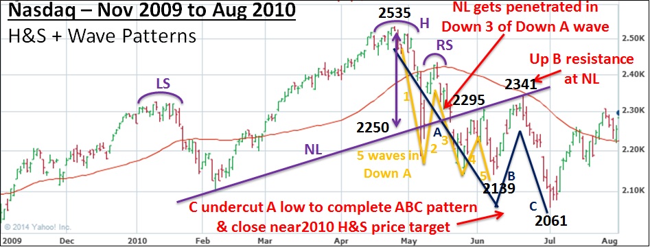
We then take this analysis one step further and combine both charts below to yield a few interesting findings. First, the neckline from the H&S pattern gets broken on Down 3 within the larger Down A pattern. 2 tests of the neckline follow before completion of the overall pattern. Second, the second test of the neckline is the completion of the Up B wave. Finally, the bottom of the Down C wave undercuts the low of the selloff from the Left Shoulder, and also undercuts the low of the Down A wave.
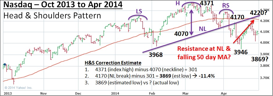
Performing the same analysis on the 2014 Nasdaq (below) yields surprisingly similar results for both types of analysis described above. First, a clear H&S pattern can be traced out with a rising neckline in purple. After the neckline breach in early April, the index quickly rose to test the bottom side of the rising neckline before getting rejected for the 1st time and retreating sharply to the 3946 low. Since Tax Day (April 15th), the index has been in rally mode through the month’s close.
Also included on the chart are calculations to estimate how deep a correction could potentially be from the H&S pattern as drawn (same process as described above under the 2010 precedent). The resulting target is 3869, which would barely undercut the 3946 low set on 4/15/14. A fall from 4371 to 3869 would mark an 11.5% correction over the course of about 2 months.
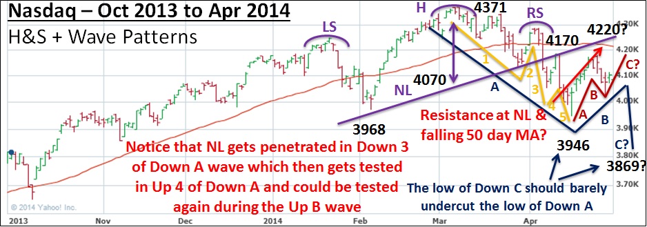
Turning to the Elliott waves, we had a fairly clear 5-wave pattern in Down A, as we saw in the 2010 precedent. Something mildly different from the precedent period is the A-B-C pattern that appears to be developing in Up B. A-B-C patterns traditionally develop in Up B, so it was odd for 2010 to not visible display this pattern. Ultimately, we’d expect the high of Up C within the Up B wave to clear the Up A peak, find resistance at the 50-day simple moving average, and turn sharply lower to complete the bigger A-B-C correction.

Combining both types of analysis yields a similar picture to 2010. The neckline was penetrated during Down 3 of the Down A wave, which then saw a sharp test of the neckline in Up 4 of the Down A wave. One final test of the neckline in Up B would serve as a great demonstration that the index is likely to get spiked lower to complete the Down C pattern, as we saw in the 2010 precedent above.
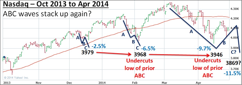
Zooming out and looking how the A-B-C selloffs developed during both periods is also noteworthy. On the charts below, you will see that the index actually formed a series of A-B-C corrections that each got larger and more pronounced than the previous. When the A-B-C waves start stacking up, that is a sign that 1—volatility is increasing, and 2—the likelihood of a bigger correction or bear market is greatly increased. You’ll notice that the low of each successive A-B-C pattern barely undercuts the low of the pattern preceding it.
Lastly (to completely drive home the point), regular readers of this commentary know how similar Thomas and I feel the 1987 market action was to that unfolding today. Keeping in mind everything we saw above: 1—A-B-C selloff patterns, 2—5 clear waves in Down A, and 3—Down C barely undercuts the low of Down A, we can immediately see a few glaring similarities between the 2010, 2014, and 1987 periods. Scariest of all is the timing of the 1987 correction: late March 1987 through mid-May 1987. Given what we’ve seen, we’re roughly estimating the Nasdaq to hit its A-B-C low around the April 2014 FOMC minutes release on Wednesday, May 21st, which would by happenstance coincide with the 1987 A-B-C selloff low timing.

In conclusion, we wanted to share these precedents to demonstrate that history does indeed rhyme in funny ways. Please remember that History & Precedent analysis is secondary in nature to us and we do not make investment decisions based upon the work we do here. We merely utilize this information to help us gauge likely risk/reward ratios in a given market environment. Since Wall Street is essentially human psychology on display, there are common themes that repeat themselves cycle after cycle. By celebrating the lessons of the past, we hope to avoid becoming ensnared in similar future situations. This rings especially true for our current predicament, in which leaders are flashing climactic activity possibly 4 to 7 months before a bigger market rout.
Investment Roadmap
In February 2014 we outlined our roadmap for the market over the next 6 years. We understand this is a bit bold if not extremely unconventional in the asset management industry, but regular readers of this commentary should understand our philosophy of why it’s helpful to construct a forward-looking projection of capital market behavior. As the mantra goes: History doesn’t exactly repeat itself, but it often rhymes, and those who forget history are doomed to repeat it. We plan to continually update the roadmap with new information as the market presents it to us. By no means do we expect markets to play out exactly as we’ve outlined—rather, this type of analysis simply helps us understand where and when the best risk/reward ratios are. Here’s our roadmap with a few updates from last month:
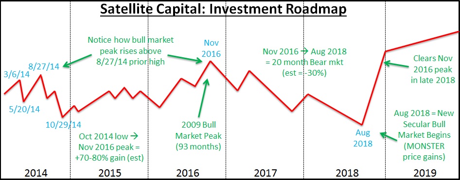
The above will be constantly tweaked as new information presents itself. Our roadmap helps us apex the market’s major turns by keeping the larger design of the market’s racetrack in mind. This larger framework is what’s important, because it’s a factor in how much risk we are willing to undertake at a given time. We remain ready and willing to change any or all of our conclusions from the above analysis as more market information presents itself. A huge component of our risk management activity is being extremely rigid with our investing rules, and very flexible with our expectations. Our job is not to predict, but to interpret. We interpret current market action and adjust our positions accordingly. We do not condone an investor using this roadmap as anything more than educational input, as we could change our positioning on a dime (and will if the market tells us we need to).
Conclusion
In summary, April’s action indicates the market is not yet ready to break down and enter a real correction. Over the next month, we should get further indication of the Fed’s likely behavior from various policy makers’ interviews and the important minutes release in mid-May. With the Fed now buying $45B/month of bonds, we wouldn’t be surprised to see the FOMC increase the taper rate to $15B/month starting at the June meeting and fully conclude Quantitative Easing by the end of Q3 (a final reduction to zero at the September meeting).
Leading stocks’ action over the next month should also be indicative of what opportunities could present themselves in the coming months. Will the former leaders climb back near their prior highs, or will they remain weak and wallow near their lows? Will emergent leadership prove broad and strong enough to power the market higher? Or does the weakened market indicate that we’re headed for choppy waters on the horizon? All these questions should be settled over the next month or two. Divergences in the market are not uncommon; the key is keeping in mind that they usually correct themselves over the course of a few months.
Regardless of what the market does, our primary objective at Satellite Capital is always the preservation of our partners’ capital. Generating a steadily rising equity curve is of secondary importance to protecting the assets we‘ve already been entrusted to manage. We’ll be moving to quarterly increments for future posts, so we’ll be back in October with commentary on 2014’s Q3 action. Have a great month!