After peaking on or just after the Fed’s September 17-18th FOMC meeting, the market entered a short-term nosedive that ended on October 9th. The U.S. government officially shut down from October 1st through October 17th, leaving 800,000 government employees furloughed until further notice and preventing several economically-focused government agencies from finalizing reports on the cycle Wall Street has come to expect. The September jobs report was delayed until Tuesday, October 22nd (from October 4th), and the October release was delayed by 1 week from November 1st to November 8th. As we’ve come to expect lately, a last-minute deal between the President and Congress averted a debt ceiling breach and sent furloughed government employees back to work. That can is now kicked down the road until January 2014, when the next battle will begin.
The indexes enjoyed yet another month of strong price gains in October. The Nasdaq is now up 29.8% for the year and the S&P500 is up an astounding 23.1%. The indices’ remarkably strong price performance this year against substantial headwinds is hardly a unique event; head to your favorite bookstore and pick up a copy of “It Was a Very Good Year” by Martin Fridson. Marty examines 10 bull markets during which the country was weathering major challenges, yet the primary indexes were defying all odds and powering strongly higher. As of this month, 2013 would go down as one of the very best years for equity markets (I remind you the year’s not over yet). I highly recommend you pick up a copy of this book.
Despite strong index performance in October, leading stocks were largely in corrective mode. The 5 stocks that we’ve called leaders throughout this phase of the bull cycle had relatively weak performances for the month. Last month, I noted in this section the following: “If at some point leading stocks start to sell off in volume, that would raise a caution flag signaling that we need to proceed with caution. Thomas and I have been watching tentatively for a potential 10-15% selloff to begin at some point very soon.” We watch leading stocks because they collectively lead the market both higher and lower. The fact that elite leaders are already correcting while the indexes continue to power higher heightens our senses for the 10-15% selloff we’ve envisioned.
This month we’ll break our market analysis down into our usual 4 pillars of market health: 1) The action of the indexes, 2) The action of the best leading stocks, 3) Sentiment & Psychology-based indicators, and 4) Historical precedent action. Remember that Thomas and I place the most weight on pillars 1 and 2 (our primary measures of market health) when performing our analysis. Pillars 3 and 4 are important, but are secondary indicators in nature and need to be treated as such.
I’m going to dive right into analysis under the assumption that readers of this commentary have read our previous installments and have developed a basic understanding of our approach to the market. For first time readers, I recommend reviewing our February 2013 Commentary and earlier to ascertain a detailed explanation of why we at Satellite Capital examine what we do, and why we are interested in certain stocks over others. And as always, please don’t hesitate to contact Thomas or myself with any questions.
Indexes
For the month of October, the Nasdaq rose 3.9% while the S&P500 climbed 4.4%. The Nasdaq ended October with only 3 days of professional selling (strong down days in higher volume than the previous day), and the S&P500 ended with only 2 days. Despite all the challenging events mentioned above, the indexes continued the run of strong returns in 2013. Some would argue that the lack of government data due to the 16-day shutdown helped buoy the indexes, while others claim that when the government finally got out of the way, the indexes could finally power higher.
The FOMC meeting on October 29-30th capped off a solid month of gains with the Fed holding steady its $85B per month bond buying program. Given the poor jobs data reported on Tuesday, October 22nd (+148K jobs), it appears the Fed will continue its bond buying program throughout the end of the year. A sharp rise in the jobs number coupled with a strong GDP increase could convince the Fed to change its tune sooner than most might think. An astute Fed watcher gets extra points for examining the psychology unfolding in Ben Bernanke’s head regarding his successor, Janet Yellen, and the ship that she will inherit.
Near the end of October, Kopin Tan said it best when he wrote in Barron’s: “A gentlemen always opens the door for the lady behind him…”. We are of the opinion that tapering will commence before Yellen officially takes over on February 1st, 2014, meaning it will be announced at either the December 17-18th FOMC meeting or the January 28-29th meeting. That said, we put relatively higher probability on the January meeting for such an announcement. As this is pure speculation based upon our technical interpretation of the market’s action, we’ll allow the action of the indexes to dictate how much capital we put into play.
Aside from the current fundamental picture, one technical cause for concern on the Nasdaq, the Russell 2000, and the NYSE Composite indexes revolves around an indicator called the Relative Strength line (briefly discussed last month). The Relative Strength line compares the price action of an index versus that of the S&P500. An outperformance will lead to a rising RS line, while an underperformance to the S&P500 will lead to a falling RS line. For the Nasdaq and the Russell, it’s generally best when the index price action moves to new high ground simultaneously with the Relative Strength line.
The RS line hit its current peak for the Nasdaq, Russell 2000, and the NYSE in early October, and has not been able to hit new highs despite each of the 3 indexes moving to new high ground by the month’s close. This is a significant divergence as it indicates our 3 indexes in question are not as strong as they should be. Divergences of this nature have often preceded periods of market weakness. Taken with everything else that happened in October, caution is clearly warranted at current levels.
Also of note at October’s end was the Nasdaq’s close at just 2% below the 4000 level, which it last reached in September 2000. At its October peak, the Nasdaq traded 22.7% below its all-time high of 5132, set in March 2000. The index has now climbed 213% from its March 2009 low, making it one of the best performing bull markets of all time. If we examine another strong historical bull market for a sense of scale, say the 1974-1980 market (a similar section in the overall cycle), we find the Nasdaq rose 178% from October 1974 to October 1979.
In summary, the indexes are looking quite strong at month’s end, with fairly low levels of distribution. Despite the apparent strength, several divergences have appeared which give us some concern. A trend can and will often continue longer than one would expect. Given the current strength being exhibited, the action of the indexes guides us to be cautiously long in only those stocks holding above proper entry points.
Leading Stocks
While October was a standout month for the indexes, the month was one to forget for leading stocks. Recall that we consider a ‘leading stock’ to be one with the strongest fundamentals (big earnings growth, sales growth, return on equity, cash flows, etc) and an equally impressive technical picture (strong prior uptrends, rising on increasing volume and falling on decreasing volume, etc). The best merchandise in the market (those stocks with the best fundamental data and technical price action) will lead the market higher, and will also hint when it’s likely to head lower. The 5 core leaders we’ve been following most of the year performed as follows: CELG = -3.6%, FB = no gain (0%), LNKD = -9.1%, QIHU = -0.6%, & TSLA = -17.2%. Another stock mentioned last month as having a strong fundamental and technical picture was YELP, which returned 2.3% for the month. As you can see, in general, the indexes and the stocks that we are calling leaders diverged from each other, which is cause for additional concern.
That brings us to our case example for the month: NQ Mobile (NQ). After going on a tear from July through October, the Chinese provider of mobile security and search products was broadsided by fraud allegations on October 24th. Revered short seller Carson Block of Muddy Waters attacked the company, stating it’s “a zero” and that 90% of the revenue NQ was reporting was fictitious. NQ stock promptly staged a complete nose dive, dropping 47% on that day alone (from a high of $23.20 to a close of $12.09). You may recall that last month we mentioned NQ exhibited a pattern that is very rare and very powerful if identified correctly (the high tight flag pattern).
We stated the underlying lesson here last month: Since we had no indication to tell us whether the pattern would work successfully, the need for a tight stop-loss to protect oneself was of utmost importance. As seen throughout this bull market cycle on numerous occasions, Chinese companies carry an extra degree of risk, and an accompanying stop-loss is especially important. From Longtop Financial Services to Sino-Forest, there is no shortage of Chinese firms that have cooked their books, thereby exposing their investors to get badly burned. NQ thus far has defended itself, stating that Baidu and Sina (other Chinese internet-based leaders) both utilize similar accounting practices. Time will confirm any truth behind Block’s accusations, but for now, NQ sits atop the ash heap of former leaders. The technical damage done to the stock by the short selling barrage will take months, if not years, to correct. Its time has likely passed.
While NQ was a stock we watched closely, we never considered it a true market-leading stock. True market-leading stocks do as their title suggests, they lead the market. To demonstrate how true market-leading stocks do in fact lead, I’ve crafted 2 charts below from a period earlier in 2013 (April 1 to July 1), and the period from September 1 through early November. On these 2 charts, I’ll examine how the leading stocks have earned their title, leading the indexes both higher and lower.
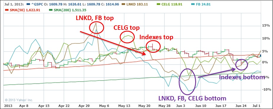
First, from late April 2013 to the June 24th market bottom, 3 of the 5 leaders we’ve been tracking closely (CELG, FB, and LNKD) have been marked on the chart below. What’s important to see is that each of these leaders reached their peak price ahead of the market. The leaders then moved into corrective phases ahead of the market, and later hit bottom before the market finally hit its eventual bottom.
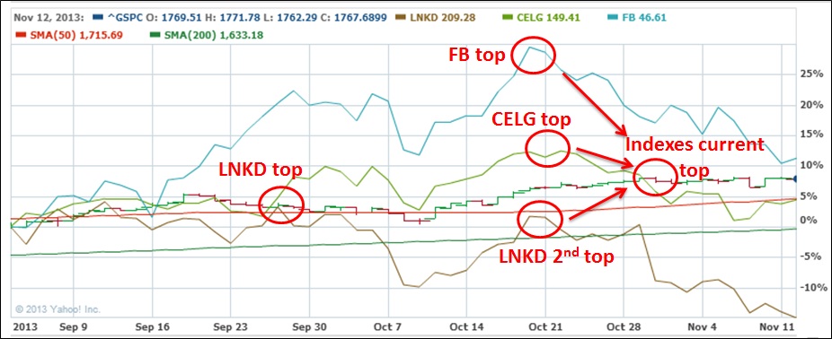
More recently, those same 3 stocks are behaving in a similar fashion as the indexes continue to power higher. As noted on the chart below, 2 of the 3 leaders below topped around October 21st, while the market’s current peak is on October 30th. LNKD is much further behind, as its current peak was back in late September.
Such action does not indicate the market absolutely must turn down, rather it’s a cautionary signal. Remember, any divergence is significant and must be noted. When divergences start mounting, trends slowly begin to change before our eyes. It’s our interpretation of those divergences in relation to how much risk we are seeking in the market that can make or break a strong year of returns.
Overall, with leading stocks primarily going through corrections, some exposure is warranted, but only if one has sufficient gains to weather a significant correction. Otherwise, cash is likely the safest position. The evidence before us indicates that a correction could be coming soon, but we must take our cues from the action of indexes and that of leading stocks. Any new purchases should be held on a tight leash with tight stop-losses in place to ensure minimal damage is done in the event a sharp downtrend emerges.
Sentiment & Psychology
This month I’ll highlight 3 secondary indicators that I’ve been watching rather closely as of late. Each of these 3 indicators is at extreme levels, indicating a lack of fear in the current marketplace. When there is a lack of or disregard for fear, caution is warranted. As usual, by themselves, these indicators don’t give a full picture of what’s happening in the market. Secondary indicators’ primary purpose is to provide us a snapshot of the environment in which we are investing. Most indicators have limited value until they flash extreme readings. The 3 measures I’ll discuss below are all at extremes, which is a hint that things could be about to change.
1. Barron’s Insider Transaction Ratio – As discussed last month, a chart is produced every week in Barron’s magazine that tracks net insider sales versus insider buys for a given week. This indicator is significant because it measures the willingness of insiders to sell out at what they feel are very fair prices from the companies for which they work. What I’ve found over some length of time is that when the ratio approaches a level greater than 45:1, the market usually has topped already or will top within a few weeks. Recent examples are when the indicator reached the 45:1 level in late September 2012, early May 2013, and early August 2013. Each of these 3 examples saw the market enter a corrective phase shortly thereafter. As of the November 4th edition of Barron’s, this ratio reached near 12-month highs around 55, which is a very bearish reading. The last week of the month saw the ratio climb to better than 35:1, which is consistent with insiders looking to dump shares at very attractive prices.
2. Stocks above their 200/50/20-day moving averages – As of November 1st, 65.99% of companies listed on the Nasdaq were above their 200-day moving averages, 56.08% were above their 50-day moving averages, and 45.83% were above their 20-day moving averages. Similarly, 78.58% of companies listed on the NYSE Composite were above their 200-day, 70.95% were above their 50-day, and 60.27% were above their 20-day. Each reading for these two indexes is near all-time highs. This doesn’t tell us when the current trend could end, but rather suggests that the likely upside potential to this market is limited. We should therefore approach the markets in a very cautious manner. This gauge is best used to assess the risk/reward available in the market, and as with the other indicators is only valuable when extreme readings are being displayed (i.e. right now).
3. Investor’s Intelligence Bulls versus Bears Survey – Every week Investor’s Intelligence surveys over 100 different advisors on whether the advisor is bullish, bearish, or neutral on the market. As of October’s close, the percentage of bullish advisors reached 52.6% and percentage of bearish advisors reached 16.5%. When taken as a ratio of Bulls/Bears, the reading is 3.18x, which is consistent with prior market tops. Any reading above 3.0 indicates excessive optimism regarding the markets. Again, this indicator doesn’t tell us that the market will roll over tomorrow or the next day, but helps us understand the current environment and how aggressive we should be with our portfolios. Consistent with everything discussed above, we are positioned very cautiously right now. The risk/reward ratio is clearly skewed toward the risk side of the pendulum for long-side equity investors.
One final reminder is that sentiment and psychology-based indicators are secondary in nature. The most important action is by far that of the indexes and leading stocks. Both Sentiment & Psychology and History & Precedent can help us work towards a deeper level of understanding of a given market environment, but we need to cement in our minds that they are of secondary importance. Last month I said: “Probabilities suggest that the market could begin to roll over in mid-to-late October (and it could be a short drop), but we need to remember that markets can remain in their trends longer than we hope or sometimes want them to.” It’s our belief that the market is likely setting up for a sharp 1-month drop. The catalyst remains to be seen, but the overall technical environment is weakening before our eyes.
History & Precedent
As some of you are aware, the Nasdaq, S&P500, Dow Industrials, Russell 2000 and many other indexes are in fresh all-time high ground. Now, the astute chartist may have just cringed upon reading that statement, noting that the Nasdaq is still drastically short of its March 2000 peak of 5132.52 (reached at the very apex of the tech bubble). As the index crashed an astonishing 78.4% by October 2002, and as that apex was extraordinarily unusual in nature, we’ll temporarily disregard the Nasdaq’s astounding feat for the sake of our analysis at hand. So for the below precedent analysis, consider that the Nasdaq is in fresh high territory since that lone bubble event, which is significant.
Through the end of October 2013, the NYSE Composite is the only major index yet to hit new highs. Below, we’ll explore the NYSE Composite’s current and historical action to see if we can glean some understanding of what could be happening psychologically in the broader market. Please remember that history and precedent analysis is purely a secondary indicator. We DO NOT make investing decisions based on analysis of the type described in this section. We examine history and precedent because certain characteristics of cycles tend to repeat themselves. These findings then serve to guide our thinking as to what may transpire in the marketplace.
As of the end of October 2013, the NYSE Composite was just 2% below its October 11, 2007 all–time high of 10,387. The index has now returned to this prior peak six years later, but has yet to clear that level. When Thomas and I examined the main historical precedent period we’ve been using for this bull market (October 1974-November 1980), we had some interesting finds from the NYSE Composite chart from each period, which we’ll walk you through on the charts that follow.
Please note that we’ll briefly touch into Elliott Wave analysis, which we’ve discussed in depth in prior commentaries. For a first time reader, Wave analysis holds that any major market move higher is comprised of 3 up moves, interceded by 2 down moves (i.e. Up 1, Down 2, Up 3, Down 4, Up 5). At the end of a 5-wave up cycle, the market shifts into a 3-wave or 5-wave down cycle (i.e. Down 1, Up 2, Down 3, Up 4, Down 5), before then moving into another up cycle. Performing this analysis successfully in real time is very much an art, and not a science. We’ve referenced the analysis this month because of the importance of what we’re seeing given our current position in the market.
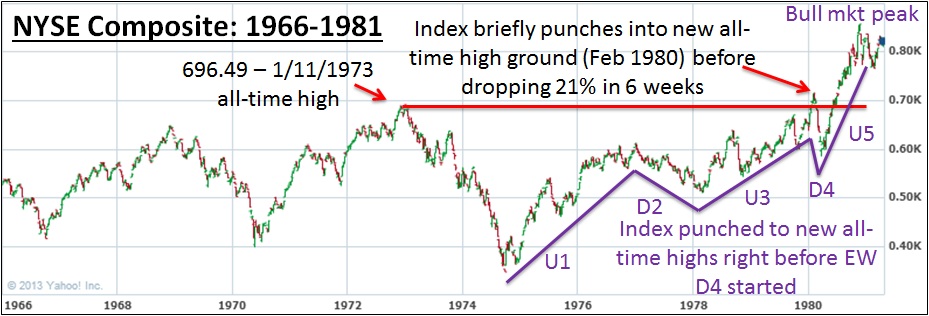
I want you to note a few things on the above chart. First, the NYSE set its then all-time high of 696.49 in January 1973, just before a crushing 50% bear market (January 1973-October 1974). After bottoming in October 1974, the NYSE then moved higher for the next 5.5 years, finally clearing its prior bull market high in February 1980. At this point, the index poked 3.6% above its prior high before collapsing 21% in only 6 weeks. Talk about a sharp drop!
As enthusiasm bubbled from the NYSE ascending, more and more participants started to enter the market. In fact, January 1980 saw the highest volume in the NYSE’s history (subtle indication that too many people are dabbling). As you can see on the chart, I’ve labeled the 5 waves for this total bull market. This analysis shouldn’t be new to our regular readers– we’ve revisited it many times over the last 12 months and will continue to do so as long as the precedent remains relevant. What’s especially important is that the top of Up 3 coincided with the NYSE setting fresh all-time highs. The ensuing Down 4 move was quite sharp and certainly wreaked havoc on many investors’ portfolios. The Up 5 move that capped the entire bull market was extremely strong, and again pushed the NYSE safely into fresh high ground at the time.
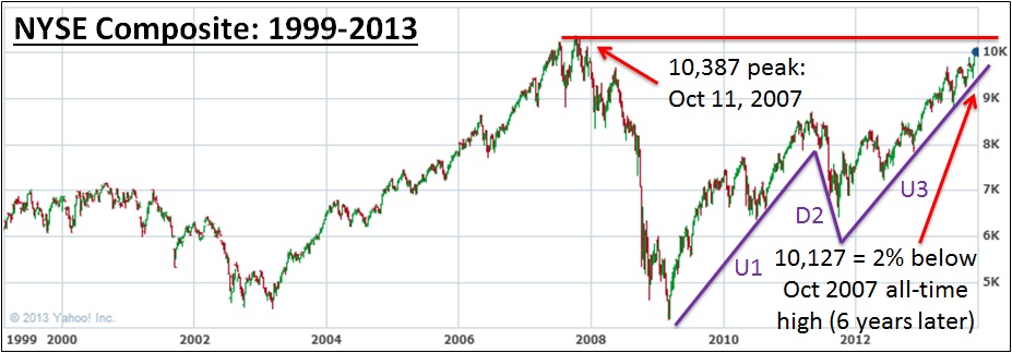
Turning now to the current NYSE action, the index notched its peak of 10,387 on October 11, 2007, as the nascent financial crisis was starting to emerge. The NYSE then plummeted 59.7% before finding its footing in March 2009. From March 2009 through the end of October 2013, the index has pushed higher and higher but has yet to eclipse its all-time high from 2007. At October’s close, the NYSE sat just 2% below the all-time high. Turning to the waves, they tell a similar story to the precedent breakdown above.
I’ve drawn the waves above as we believe them to be unfolding for our current market (recall this is an art in the moment and a science after the fact– hindsight is 20/20). If we’re correct, we should be approaching the top of the larger Up 3 wave, which, if adhering to the precedent laid out above, could punch through to fresh all-time highs before a bruising Down 4 wave unleashes. Based on current action, we feel we could reach all-time highs at some point over the next 4 months, though we remain cautious and envision a sharp 10-15% pullback before such a sharp rise would occur (such a consolidation is necessary to line up smaller waves within the larger Up 3 wave pictured above).
So the two periods above have many similarities. “History doesn’t repeat itself, but it often rhymes” is an old Mark Twain quip that investors are wise to observe. Our current market roadmap has the NYSE notching a short-term top in mid-November before a short 2-week fall into early December. This should be followed by a strong burst into mid-December, carrying the index within striking distance of its all-time high of 10,387. We then are looking for the 10-15% correction we’ve been awaiting to transpire between mid-December and late-January 2014. After the selloff, the index should bottom around late January and then power higher through March 2014, which would mark a major market top and definitely carry the NYSE into all-time high ground. Wave Down 4 for entire bull market is then likely to set in between March and June 2014, with the index falling 20-30% over a 2.5 month period. Ouch.
Please remember this is purely a roadmap. We do not invest based upon the roadmap, we use it to help us gauge prior cycles. As always, we look to the action of indexes and leading stocks as primary indicators to tell us when to be invested and when to be in cash (or short). Next month we’ll examine a “Down 4 – Up 5” that could prove to be very similar to what plays out between December 2013 and March 2014.
Conclusion
In summary, October will go down as a month of divergences. While leading indexes have powered to fresh highs, leading stocks have already entered corrective phases. Sentiment and other indicators are at extreme levels, suggesting the psychological undertone of the market is more conducive to risk than reward for long investors. While this trend can continue longer than we may hope or want, we need to allow the action of indexes and leading stocks themselves to dictate how much exposure we seek in the market.
We are now 4.5 years into the bull market that started in March 2009, which is approaching the long end of the spectrum for historical bull markets. Many changes expected over coming months could shape how long this bull move continues. From the incoming Fed chairperson on February 1st to the inevitable debt ceiling rehash in Washington at the start of the new year, the coming winter will certainly provide a stage for the market to make potentially dramatic moves. One of the most interesting influential factors will be Ben Bernanke’s transfer of the Fed reigns to nominee Janet Yellen.
I’ll end this month with another quote from Kopin Tan, as it speaks to our perception of the market as a collection of human participants rather than machines. Examining the psychology within those people, and monitoring whether they’re excessively bullish or bearish can help determine the optimal level of risk one should seek in the market. As Tan pointed out, “A gentleman always opens the door for the lady behind him so she won’t have to huff and puff.” Let’s see what Ben Bernanke does through his final two meetings as Fed chairman. Have a great November and Happy early Thanksgiving!