Since that time, the major indexes have diverged; the Nasdaq and the Russell 2000 have hovered near their highs, while the Dow, NYSE and S&P500 have sold off. The leading stocks that we follow at Satellite Capital have truly represented the proverbial canary in a coal mine. Those stocks we’ve been following closest – CELG, FB, LNKD, QIHU, & TSLA – continue to lead with very strong returns. A few other stocks have caught our eyes in recent months – NQ and YELP – and we’ll discuss those stocks below in this month’s leading stock analysis. A characteristic of a strong bull market is innovative stocks with strong fundamentals and technicals to match. NQ and YELP are extremely strong in both areas, and are exhibiting price action consistent with some of the biggest winners of all time (similar to the 5 other leaders we’ve been closely watching).
What exactly does this action tell us? Despite the recent weakness exhibited by the indexes, the fact that leading stocks are bursting higher indicates there is still a high level of underlying strength supporting the market. Leading stocks pull the indexes higher and lower depending on their respective trends, and the fact that these stocks are drastically outperforming their index counterparts is indicative of likely continued positive price action on the indexes. If at some point leading stocks start to sell off in volume, that would raise a caution flag signaling that we need to proceed with caution. Thomas and I have been watching tentatively for a potential 10-15% sell off to begin at some point very soon.
This month we’ll break our market analysis down into our usual 4 pillars of market health: 1) The action of the indexes, 2) The action of the best leading stocks, 3) Sentiment & Psychology-based indicators, and 4) Historical precedent action. Remember that Thomas and I place the most weight on pillars 1 and 2 (our primary measures of market health) when performing our analysis. Pillars 3 and 4 are important, but are secondary indicators in nature and need to be treated as such.
I’m going to dive right into analysis under the assumption that readers of this commentary have read our previous installments and have developed a basic understanding of our approach to the market. For first time readers, I recommend reviewing our February 2013 Commentary and earlier to ascertain a detailed explanation of why we at Satellite Capital examine what we do, and why we are interested in certain stocks over others. And as always, please don’t hesitate to contact Thomas or myself with any questions.
Indexes
For the month of September, the Nasdaq rose 5.1% while the S&P500 climbed 3.0%. Despite fears of the U.S. Federal Reserve tapering its $85B per month bond buying program and an escalation of the situation in Syria, the indexes ratcheted higher right into the Fed announcement. As often happens in the market, the strong price action exhibited by the indexes preceded unexpected good news, in this case that the Fed would not start its taper this month, as had been widely expected. This brought cheers from investors and resulted in a short-term top for most indexes. You’ll notice that only by observing and acting on the market’s technical action could you have participated in this move. The action of the market usually leads major news announcements and this time was no different. Indeed, buying the rumor (positive index price action) and selling the news (the day the Fed announcement came out) would have been a profitable play.
Since the September 18th Fed-induced peak, the S&P500, NYSE Composite, and Dow Jones indices have sold off somewhat sharply, while the Nasdaq and the Russell 2000 continue to hover and even notch new bull market highs. While both the pending government shutdown set to take effect on October 1st and the approaching debt ceiling limit on October 17th could influence capital markets significantly, we can’t yet be sure what the primary driver will be. We need to closely monitor these situations and know that since 1976, the federal government has gone through 17 shutdowns. October 1st won’t be the first (if it happens), and it most certainly won’t be the last. The Federal Reserve also technically defaulted on its debt in April 1979. No matter what the media tells you, be sure to check your facts.
The Nasdaq has clearly been the leading index since late April, as demonstrated by its relative price strength line (RS line), which is a comparison of the price action of an index or stock versus that of the S&P500. An outperformance of the S&P500 produces a rising line and vice versa. The Nasdaq’s RS line hit its highest level in more than 5 years in the last week of September, which bodes very positively for the type of stocks that we follow at Satellite Capital. Typically, most young, upstart growth companies list their shares on the Nasdaq, which leads us to focus more closely on this index than others. Growth and innovation drive investment returns for astute investors.
In summary, the indexes are currently in a state of divergence. The Nasdaq and Russell 2000, the 2 indexes we look to for leadership in truly strong markets, have performed beautifully and haven’t sold off more than a few percent from their bull market highs. Meanwhile, the S&P500, NYSE and Dow have gotten hit much harder, and have sold off from their highs all the way to their 50-day moving averages, where each is currently finding support. All divergences eventually converge to a single trend, and we need to be cognizant of the fact that said trend could be in either direction. At least in the short-term, the positive action of the Nasdaq is helping the stocks we follow to power higher with minimal resistance.
Leading Stocks
The best fundamentally sound stocks had a very strong September. Here’s the performance of the 5 leaders we’ve been watching in recent months: CELG = +10.1%, FB = +21.6%, LNKD = +2.5%, QIHU = +6.8%, & TSLA = +14.4%. The best merchandise in the market (those stocks with the best fundamental data and technical price action) will lead the market higher, and will provide hints when likely to head lower. For now, the basket of leadership we follow closely is exhibiting dramatically positive returns.
Two new stocks that leapt onto our target list this month are NQ and YELP. NQ rose 28.6% in September, and YELP climbed 27.3%. Both stocks broke out of a rare high, tight flag pattern, which has historically been the most powerful of all technical chart patterns. Another of our leaders, TSLA, broke out of this same pattern in July and is currently up more than 80% since then. The best model book stocks that we identified throughout history exhibiting such price behavior went on to surge 200% to 500% over a relatively short period of time after their respective breakouts. This is not to say similar results will unfold for our above 3 stocks in question (or even any of the 3), but as we play a game of probabilities, we accordingly strive to place our chips on outcomes that are likeliest to have big payoffs. Adhering to strict loss-cutting policies allows us to acquire and hold potentially volatile stocks of this nature, while keeping us out of any real danger.
One item to note is that the Internet-Content market sector has seen a dramatic increase in the number of stocks powering to new highs (this helps partially explain the Nasdaq’s drastic outperformance of the S&P500 and other less tech-focused indexes). Group moves are like a rising tide that raises all ships: As the tide rises in the stock waters, some stocks are able to power higher than others depending upon their fundamentals, their growth story, and the management that is catalyzing the companies’ growth. As you might expect from us, NQ and YELP have outstanding fundamentals (big earnings growth, sales growth, ROE’s, FCF, long-term growth rates, etc) and the requisite technical price action to back up their stories. Both stocks are prime examples at this stage, as exemplified by their stellar September.
Overall, leading stocks are looking very strong and price action dictates we pursue some exposure to the market. Despite tracking many leaders, it only takes 1 or 2 to make a great year for an individual or a fund. Entering positions in the very best stocks at precisely the right moment is vital to ensure an investor is able to weather eventual future corrections. Blindly jumping into leading stocks can be a recipe for disaster. Only via proper entry points can an investor limit his or her risk sufficiently when making new purchases. We encourage you to follow the same 7 stocks discussed in this commentary, but to be wary that each carries a proper time for initial purchase.
Sentiment & Psychology
This month, I’ll discuss 3 secondary indicators we watch closely that have proved helpful in evaluating the sentiment & psychology present in the current market environment. By themselves, these indicators don’t give a full picture as to what’s happening at a given moment. The beauty of these indicators is when you couple them with market action and look for divergences. Any divergence is significant and must be noted.
1. Barron’s Insider Transaction Ratio – Every week in Barron’s magazine, a chart is produced that tracks net insider sales versus insider buys for a given week. This indicator is significant because it measures the willingness of insiders to sell out at what they feel are very fair prices from the companies for which they work. What I’ve found over some length of time is that when the ratio approaches a level greater than 45:1, the market usually has topped already or will top within a few weeks. Recent examples are when the indicator reached the 45:1 level in late September 2012, early May 2013, and early August 2013. Each of these 3 examples saw the market enter a corrective phase shortly thereafter. As of the September 30th edition of Barron’s, this ratio reached near 12-month highs around 50, which is a very bearish reading.
2. NYSE & Nasdaq Advance/Decline Line – As of the end of September, the NYSE A/D line appeared on the cusp of moving into new highs, while the Nasdaq A/D line has struggled at its late July 2013 peak and also has yet to make new highs. This is indicative to me that the breadth in the market is not quite as strong as it was in early rallies, and the market is starting to tire out a bit. Though the NYSE index made new highs on the Fed ‘no-taper’ news, both the index and its A/D line have since retreated, exhibiting the same weakness. The fact that the Nasdaq has been able to hit new highs while its A/D line has not is a divergence that must be noted. Even the worst market sell offs in history saw chinks in their armor before the real selling began. The key is to understand the total picture of what’s happening and to position your portfolio appropriately.
3. NYSE & Nasdaq New High/New Low Oscillator – Another measure of market breadth is to examine a 10-day moving average of the market’s new highs versus new lows. A strong bull market will see continually advancing values of new highs, demonstrating breadth and overall market strength. The move from late June to early August saw a strong run-up of new highs that have been nowhere near close to peaking. Since setting highs in early August, the number of new highs has expanded from the August 27th selloff low, but at a much slower pace than before the early August peak. This divergence (the oscillator hasn’t hit new highs while each of the indexes has moved into new high ground) is significant and demonstrates that the rally is not as robust as it once was.
One final reminder is that sentiment and psychology-based indicators are secondary in nature. The most important action by far is that of the indexes and leading stocks. Both Sentiment & Psychology and History & Precedent can help us work towards a deeper level of understanding of a given market environment, but we need to cement in our minds that they are of secondary importance. Probabilities suggest that the market could begin to roll over in mid-to-late October (and it could be a short drop), but we need to remember that markets can remain in their trends longer than we hope or sometimes want them to.
History & Precedent
This month, I want to continue on the theme of Elliott Wave analysis as it relates to what we are currently looking for on the indexes. Remember, History & Precedent is a secondary indicator and we use it to simply guide our thinking as to what may transpire in the marketplace. The charts and discussion that follow are merely our attempt to convey similarities that we’re seeing between very different historical time periods. Below, I am going to reiterate a point made in the July commentary and introduce another similarity to the 1974 to 1980 bull market that we’ve been examining.
First, in our July market commentary we demonstrated that the 3rd wave higher in a bull cycle (out of 5 total) must be the longest wave. Here are the charts and table we produced that speculate the timing the current move has until completion (at a bare minimum). I kept the 1974-1980 precedent move for comparison to demonstrate the point I’ll pursue. I’ll also repost some commentary from July as it’s important to keep in mind when we’re analyzing the timing of the bull move in question:

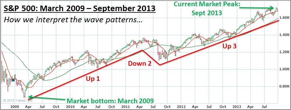
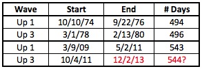
What I want you to take from this example is that Wave Up 3 is always longer in duration than Wave Up 1 (this is true of every bull market in history, not just the precedent being used here). For the precedent bull market above, it worked out that Up 3 from 1978-80 lasted just 2 days longer than the preceding Up 1 pattern.
Applying the same logic to the current bull market, the period we are considering our Up 1 (see 2009 bull market chart above) lasted for 543 trading days (which excludes weekends and holidays, i.e. this count is based only on actual days when the market was open for business). Keeping in mind that Up 3 has to be longer than Up 1, if we add 544 days (the minimum number of days the current Up 3 will last), we wind up with 12/2/2013 (again, this date has weekends & holidays removed to get a pure comparison of actual trading days). This date is simply the earliest day that the current Up 3 wave can end. The more likely scenario is that we get some slippage into Q1 2014. From this analysis, we’ve got plenty of room left in this bull market Up 3 wave to capture sizable market gains through the end of 2013 and even into 2014.
The above analysis as presented in July still holds at the end of September. We’re still looking for a drop of 10-15% on the indexes to help form a mini Down 4 wave within the bigger bull market Up 3 wave presented on the chart above. It still holds true that the earliest this bigger move can end would be 12/2/2013. We stand by this date.
The second objective of this review is to compare the % change of the leading index over each time period. Utilizing the precedent period on the Nasdaq from the October 1974 market bottom of 54.69 (i.e. the start of Elliott Wave Up 1) to the February 1980 Up 4 peak of 165.64, the index ran an incredible 202.8%.

If we look at the Nasdaq from its bottom at 1265 in March 2009 through its close at the end of September 2013 (3771), the index has already run a very strong 198.1% (not pictured). In other words, we are within 4% of the return generated during the precedent period. The similarities of these 2 periods don’t end there, but I’ll save additional details for future commentaries. Remember that though the percentages are oddly similar, index action and stock action dictate how we position our portfolios. This measure and analysis is purely secondary and helps us understand what could likely unfold.
To close this section, I can assure you that if I’ve drawn the waves correctly, which I feel I have, then the current Up 3 wave will not end before December 2013. As stated above, I’m estimating we’ll see a few months of slippage into Q1 2014 when the 5-wave pattern that started on October 4, 2011 finally ends. When that time comes, it will be imperative that an investor exit the market completely or start to move short, as portfolios far and wide will be devastated. In the meantime, the prudent investor should buy fundamentally sound leading stocks when proper price targets are hit, but otherwise remain cautious and only enter into positions under strict stop-loss policies.
Conclusion
In summary, despite some choppiness to end the month of September, leading stocks look great. Their continued positive price action indicates there’s likely substantial room left in this bull move. While we feel the move will possibly last through March 2014, we need to let the action of our stocks tell us when to enter and exit positions. By focusing too much on the market, we risk clouding our ability to interpret what could be a very positive move for a stock. Or, in metaphoric form: Watching the forest too intently could lead us to miss that individual tree growing over and above the rest.
Given the combined insights from our 4 pillars above, we see big things for the market into year’s end and even into Q1 2014. Remember to focus on what your portfolio is doing in the coming month as the bureaucrats in Washington will be spewing their usual rhetoric. By focusing on your actual portfolio, you should be able to avoid making emotional decisions based upon the minimally important action of politicians. Those who best position their portfolios given the factual information in front of them will surely outperform during this period. Have a great month!