Complacency is a dangerous sentiment in capital markets.
Our summer hiatus involved a copious amount of study, not only because of the gravity of the impending collapse, but because an environment of complacency breeds distraction from the underlying forces that cause tectonic market shifts. A common question we get when discussing upcoming market corrections is, “What will cause the crash?” Ebola? ISIS? A natural disaster? But rather than looking outward, investors should instead look at the system internally. Causation for such a collapse is likely already baked into the market, regardless of what exterior stimulus may appear to tip the scale in coming weeks. In this calm before the coming storm, we resolve to let such ‘causes’ surface via hindsight and focus on trading technically. Now is not the time to get lax on analysis.
So, given that current news is relatively rosy, our focus reverts to an investor’s primary job: identifying when the reward for assuming investment risk is unfortunately commensurate with the potential for capital loss. The saying goes that when news is rosy, everyone who wants to buy already has. This leaves a vacuum for the first people to come in and sell, thereby exacerbating the situation and fueling more selling. Since the majority of investors don’t sell short at all—truly, most aren’t even familiar with the mechanics of selling short—the average investor is limited to making money in uptrending markets. If the only way an investor can make money is being long a stock or other financial security, the risk of being wrong increases in the other two thirds of the game (sideways or downtrending markets). The key, as usual, is knowing exactly when each of the three trend possiblities are underway. That said, we’re at a critical juncture in the market. The Federal Reserve is winding down its massive stimulus program known as Quantitative Easing. The current economy is a drastic improvement over that from a few years ago, and individual companies in the global marketplace are producing record profits in a low inflation environment. Both economic and technical confluences abound.
Below, I’ll lay out the evidence as we see it that a bull market peak was set in September 2014, and that the remainder of 2014 is going to be one for the bears. This is not the tale of a gradual 10% selloff like those called for endlessly by media pundits. We’re talking about a dramatic correction that will rock the very foundation of the global financial system. Think of the first leg down in 1929, in which the Dow Jones jettisoned 49.4% of its value between September 3rd and November 13th (chart to follow). Or the 1987 crash, in which the Nasdaq careened 36.7% from its September 1st peak to its October 28th low (chart also to follow). These are exactly the type of violent, waterfall-like drop that we ascribe a very high probability of occurring in the final 3 months of this year.
Accordingly, we’re content to miss a little potential upside reward in the event that our modeling is incorrect, and the market somehow marches higher throughout the year’s end. We would rather be wrong and safe than wrong and invested long in the market during a 20-30% correction. Minimal foregone gains pale in comparison to a potential massive loss. Indeed, deciding not to play the game at all in times of unusually artificial risk is sometimes the best play of all. This is without question such a time.
Regular readers of this commentary know that we normally break our market analysis down into what we’ve deemed our ‘4 pillars of market health’. Our unusual current situation doesn’t mean we should abandon our structured analysis methods, meaning we’ll keep the usual structure for this month’s writing. So without further ado, our 4 pillars of market health: 1) The action of the indexes, 2) The action of the best leading stocks, 3) Sentiment & Psychology-based indicators, and 4) Historical precedent action. Remember that Thomas and I place the most weight on pillars 1 and 2 (our primary measures of market health) when performing our analysis. Pillars 3 and 4 are important, but are secondary indicators in nature and need to be treated as such.
I’m going to dive right into analysis under the assumption that readers of this commentary have read our previous installments and have developed a basic understanding of our approach to the market. For first time readers, I recommend reviewing our February 2013 Commentary and earlier to ascertain a detailed explanation of why we at Satellite Capital examine what we do, and why we are interested in certain stocks over others. And as always, please don’t hesitate to contact Thomas or I with any questions.
Indexes
Considering the gloomy forecast I painted above, let’s get right to it: the market appears to be building a top. Typical tops before sharp declines see increased daily volatility (i.e. the average daily trading range for a particular index or security) and a run-up of at least 10% leading to the eventual market peak. Volatility has certainly been increasing, and daily price spreads are expanding, but conspicuously absent as of yet is the final run-up of at least 10% on one of the indexes.
Our Dow 1929 market top precedent upholds this pattern nicely. The index ran over 14% from 8/7/29 through 9/3/29, and what followed is legendary (-49% over the subsequent 2 months). This final run-up isn’t a fail-safe metric, however. Our other main market top precedent in 1987 (more on these below in later sections) offered up a curveball, with the Nasdaq failing to pop the final requisite 10%. This could have lead one to conclude that further upside remained, but a simple examination of the other main indexes would have revealed that the party was over—the Dow Jones, S&P 500, and NYSE Composite all experienced a 10%-ish run to their late August 1987 peaks.
After a somewhat lackluster September 2014, the indexes appear to have reached their peak on Friday, 9/19/14 (the same day Alibaba had its IPO). The reasonably strong action so far this year has driven indexes into cautious territory. Milestones of note are the Nasdaq rising +100% from its 2298 low in October 2011 and the S&P 500 achieving a +200% gain from its 666 low in March 2009. A great majority of index rallies throughout history have struggled at round numbers. Rarely are these round numbers an actual index value (i.e. 2000 on the S&P, 4600 on the Nasdaq or 17000 on the Dow), but more commonly involve round numbers in the sheer percentage gains that an index generates, i.e. multiples.
We’ll examine the relationship between our current indexes and our historical precedents more deeply in the sections that follow. For now, simply know that in October 2014, an investor would be wise to prune aggressively any positions that aren’t performing or those that have modest gains. Risk dominates reward right now and an investor would be wise to heed our advice and lock in any profit available. Please remain on high alert for the next few months; throwing 20-35% of your portfolio value out the window is wholly unnecessary considering it costs nothing to observe from the sideline.
Leading Stocks
While many of the best fundamentally sound stocks are still behaving well in the market, a broad look across each of the core indexes (Nasdaq, S&P 500, NYSE) reveals that the vast majority of stocks are struggling while said indexes are at highs. A recent examination of NYSE stocks revealed that only about 40% of the index’s stocks were above their 200-day simple moving averages, despite the NYSE being only about 4% off its peak. This divergence signals weakness, and hints further that underlying market action is somewhat artificial going into Q4 2014. Weakness aside, there are still several stocks either consolidating near highs or already moving strongly into new high ground. What this doesn’t mean is that we’ll have a typical shopping list for you this time—now is not the time to buy stocks! What I will try to do in this section is hint at some of the spaces and trends we see as having the most potential in either the last throes of this bull cycle, or the beginning of the next.
I’ll profile below what we feel are the 7 best stocks in the market right now. Please note these are not buy recommendations for the companies listed below, and especially not considering where the market is currently headed! My classification of ‘best stocks in the market’ is made by assessing both fundamental strength (best earnings growth, best sales growth, high ROE’s, etc.) and technical strength (strong price action, stock hitting new highs in strong volume, etc.). If the market has topped as we believe, the stocks listed below have the potential to form final blowout tops, as the best leaders tend to briskly shoot higher in the face of a topping market. Considering the magnitude of the drop ahead of us though, I can’t condone entering a position in any of these stocks at this late date. Blowout tops can reverse just as quickly as they form, and carry huge risk for those arriving (un)fashionably late. If you are playing with the proverbial fire that is one of our top movers at this late date, you must be extremely quick on the trigger to sell if the stock reverses lower. Protect your capital! I’ll also point out that at a market top like the one we’re currently tracing, the absence of a true blowout top by a stock can be a hint that said stock isn’t yet done with its major move. It’s critical to evaluate how these leaders weather a violent market correction, to see which break down completely, and which consolidate in a healthy manner to emerge as a winner in the next bull cycle.
In every bull market, there is one stock that exemplifies world-class price action coupled with stellar fundamentals more than any other. To us, that stock is Tesla Motors (TSLA). Tesla began its monster run in April 2013 and has remained the dominant market leader ever since. For those of you asleep at the wheel(wink), Tesla manufactures a market-leading fully electric car (the Model S sells for a base price of around $70,000) capable of traveling 200-300 miles on a single charge. Unlike its hybrid counterparts or other fully electric competitors, Tesla’s technology is just next-level (the next-best alternatives on the market only get 70-80 miles on a single charge). Despite his dominace, Tesla chairman and founder Elon Musk isn’t resting on his laurels. The ‘Gigafactory’ Musk recently announced should eventually enable the company to build over 500,000 cars annually. Tesla’s Model III is slated to launch in 2017 with a selling price of around $35,000, a move highly reminiscent of Henry Ford’s Model T release (an affordably-priced offering targeting the masses in lieu of the luxurious Model A). Keep your eyes on this company and its visionary founder.
Another company dominating its market segment is Gilead Sciences (GILD). Gilead is the manufacturer of the blockbuster Hepatitis C drug Sovaldi, which sells for $1000 per pill (a 7-week daily regiment costs $84K). This stock has monster earnings, monster sales gains, and a product with a cure rate in excess of 90% (the next closest competitor is barely at 70%). GILD’s price action reminds me of a company in the 1990’s with a very similar story and product. That stock was Amgen, and its share price ran up from $14 (split-adjusted) in October 1990 to almost $80 in January 1992 (about a 15-month move). The interesting fact about Amgen’s move was its resilience in the face of the crushing bear market of 1990, during which time the major indexes lost 30-35% of their value. Amgen weathered this sharp drop by tracing a relatively minor correction of about 20% and exploding once the weight of the market was lifted. We’re looking for similar behavior from Gilead when the Great Crash hits in the next few months. Keep this stock on your radar.
The social media space is home to two clear market leaders: Facebook (FB) in the U.S., and Baidu (BIDU) in China. Both companies have strong fundamentals, hold dominant positions in their respective markets (online media and search), and the stocks of both companies have performed accordingly. FB is in the midst of its main run, while BIDU was arguably the biggest winner from the 2009-2011 bull move (the stock rose more than 1100% in 2 years). It’s clear to us that the stories are still intact for these monster winners and we feel each merits attention over the coming 12-24 months, especially after the Great Crash this fall. If you’re alarmed to not see Twitter (TWTR) on our short list, it’s because the stock is still consolidating from its post-IPO peak (and sharp drop), and has yet to post the kind of earnings we’d like to see in a winner. If the company is able to put up the requisite earnings and its stock price reaches new high ground, TWTR could prove a major winner in the next cycle. A great example of one we’ll monitor closely in the aftermath of the upcoming correction.
With all the recent data breaches at major retailers and banks alike, one company stands above the rest when it comes to advanced firewall security: Palo Alto Networks (PANW). Palo Alto is piloted by former Cisco and Juniper executives who have engineered a product that is absolutely dominating the computer security industry. And Palo Alto walks the walk too—huge earnings and sales growth, a strong return on equity, and a runway of growth that seems ever-expanding as data security becomes increasingly part of the digital landscape. Definitely keep your eye on this company, as the demand for this industry won’t abate anytime soon.
Two recent IPOs dominating the market right now are GoPro (GPRO) and Mobileye (MBLY). Both companies came public with strong fundamentals, already dominant market positions, and have been rewarded handsomely with monster price gains in their share prices. While GoPro, a maker of durable super-high-definition cameras for the outdoor extreme sports types, feels more of a fad-like story to us, the story could have more than enough runway for the next 12-18 months. Mobileye, on the other hand, is taking advantage of camera technology to push the auto industry towards true driver-less cars. Mobileye is the major player in the market and already has contracts with almost all the major automakers. The stocks of both companies are behaving extremely well in the short-term and should be watched for further strength.
Lastly, the biggest stock story of the last few months is easily that of Alibaba (NYSE: BABA), which came public on Friday, September 19th (the day we feel the market peaked). Shares were initially priced at $68, quickly jumping into the $90s as the company’s stock began trading on the NYSE exchange. Alibaba has huge earnings and sales growth, a strong return on equity, low debt, and controls roughly 80% of China’s ecommerce market. The company handles more transaction volume than both EBay and Amazon.com combined, a testament to the vision and drive of the company’s unique founder Jack Ma. Check out the recent 60 Minutes piece on Ma for a great profile of the company and its charismatic founder.
As a rule, Thomas and I don’t touch IPOs until after at least 3 weeks of the company’s stock trading to allow shares time to settle down and demonstrate to us some semblance of institutional buying, selling, or indifference. We’ve studied most of the big tech IPOs over the last 20 years and were surprised to find that most leading companies proceed to lose 60% from their IPO peak before they start their major advances (look at YHOO, BIDU, FB, LNKD & QIHU for examples). That said, one company’s IPO aligns closest with BABA’s current story—Google (NASDAQ: GOOGL) in August 2004. Google came public as an extremely profitable company, much like BABA just did. The stock priced its IPO at $85, quickly traded up to $115, corrected more than 15% to $100-ish over the next 3 weeks, and then promptly doubled over 8 weeks. As of this writing, BABA reached $99.70 on its first day of trading, and has since corrected about 15% from its peak. We estimate that BABA certainly has the potential to soar at GOOGL’s level, but are patiently waiting to see which of the scenarios above will emerge (-60% or a rapid run higher after a short consolidation).
There’s one last crucial similarity between Alibaba and Google, Facebook, Yahoo and the other myriad of monster stock winners throughout history. These companies have revolutionary products that fundamentally alter the way business is being conducted. Their fundamentals are near or at the very top of their market segments, and the businesses generally enjoy a moat that protects their ground. With that, major institutions must accumulate the shares of these vibrant companies shortly after their IPO. Alibaba is no different. Facebook did take 4 months to correct from its IPO high of $45 to its eventual low just below $18, but the story was already in place, and the company’s supremacy had to blossom to fruition in the company’s stock price. After falling to just below $18 in September 2012, the stock trades at $80 only 2 short years later (+400% for those of you who are interested in making real money). Alibaba sports a similar story and we feel it’s a foregone conclusion the stock will have a monster run through 2016. The important part is timing those initial buys and follow-up buys to maximize after-tax profits on an 18-24 month stock move.
As of this writing, several stocks are still acting well despite the cracks that have been surfacing in the broader market. Ensuring that risk is balanced with a well-placed sell stop order is the surest way to protect gains and ensure you’re not caught with your pants down in a waterfall selloff. Again, we urge all investors to be extremely cautious and prune their stock holdings into the middle of October. If the Great Crash of 2014 does emerge over the next few months, the upside is that there’ll be several leaders selling at incredible bargains near the correction lows. Stocks exhibiting unusual strength with dynamic stories ahead of the correction are BABA, FB, TWTR, LNKD, PANW, GILD, MBLY, GPRO and ANET. Now is not the time to buy these dynamic companies, but we urge you to watch them closely throughout the rest of 2014 in hopes of capitalizing on any opportunities the market collapse may provide in its aftermath.
Sentiment & Psychology
I’ll now walk you through several pieces of information that, to us, tip the scale in favor of a 20-30% market correction in the final 3 months of 2014. Recall that investing is a risk/reward relationship and that for each level of risk, there is some probability distribution of potential reward. We maintain that the risk of owning stocks long in this environment is extremely high, and the potential reward (i.e. gain in the event that our analysis is wrong) is almost non-existent for the level of risk we perceive. Here we go.
R.I.P. QE3
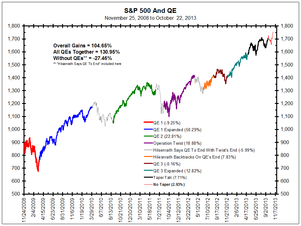
The Federal Reserve plays a huge role in the U.S. economy. As most readers are aware, the Fed meets 6 times per year and releases a statement at the conclusion of its meeting, and the minutes from the meeting 3 weeks after the conclusion of the meeting. Unsurprisingly, the market is often hypersensitive to every intonation from the Fed about potential changes in monetary policy. Key upcoming dates through the remainder of 2014 are as follows: October 8th (Minutes), October 29th (Meeting), November 19th (minutes), and December 17th (Meeting). At any combination of these events, the market should demonstrate an increased degree of volatility. The Fed is expected to end its Quantitative Easing program at the October 29th meeting, upon which point the Fed would not be injecting any stimulus into the economy.
A clear correlation has been noted in the financial press about the performance of the market with and without Fed accommodation. In 2010 and 2011 at the conclusion of the last rounds of Fed quantitative easing, the market went into correction absent Federal intervention in the bond markets. 2011 was especially interesting because the market topped even while bond buys were nearing their short-term end (May 2011 market top versus June 2011 end of QE2). From July 2011 to October 2011, the market suffered a blistering correction. In fact, since 2009 there have been 3 periods of time where the Fed has not been pumping the economy full of liquidity. In each of those 3 instances (2010, 2011, 2012), the market suffered at least a 12% correction from high to low.
All of this isn’t to imply that just because the Fed is planning to end its current round of Quantitative Easing at the October 29th meeting, the market is going to experience a sharp selloff. The point is that the Fed is pseudo removing stimulus, which has been historically bad for U.S. equity markets. The chart below should help you understand why a checkmark belongs in the “risk” column given what we see happening per the objective guidance of the Federal Open Market Committee.
Excessive Optimism
When it comes to the bullishness of investment advisors in 2014, the only relevant parallel with which we can draw is 1987. Every week, Investor’s Intelligence looks at a broad base of financial recommendations from various advisors to determine whether the advisors are bullish, bearish or neutral. The 5-year high for the bulls was set at 62.6% earlier in 2014, and the 5-year low for the bears was set in early September, with a reading of only 13.3%. Bullish readings above 50% have, in the past, indicated excessive market optimism. Similarly, readings below 20% in the bearish camp have often proved the key inflection point where complacency set in and investors let their guard down.
In 1987, the ratio of Bullish-to-Bearish exceeded 4:1 fairly regularly throughout the year. Not since that time has this feat been repeated. You shouldn’t be surprised to hear that in 2014 we’ve had regular readings of 3.5:1 or 4:1 throughout the year. When excessive bullish sentiment pervades the market, a caution flag should be raised in recognition that the market is frothy. Sustainable returns are typically not generated in frothy markets.
Transfer to Large Caps
Looking at standard investment classifications yields to us that large cap stocks have been strongly outperforming small cap stocks in 2014. Growth companies have also been outperforming value companies. Historically, large caps beat small caps when the Federal Reserve begins raising interest rates. Thomas and I assess that we are at around the point in the overall cycle where the economy is improving, the Fed needs to start raising rates, and hence the companies that will lead throughout the remainder of the bull market cycle should skew towards large cap growth, which is extremely characteristic of late-stage bull market action. We believe we are at the precipice of this shift, and only after the October-to-December correction will this shift fully take hold.
U.S. Dollar Strength
We’ve also been closely watching the U.S. Dollar relative to a basket of other G-8 currencies. Typically, a stronger USD makes it more expensive for foreign countries to purchase the goods of large, multinational corporations. Since July 2014, the U.S. Dollar has been on a tear and essentially gone vertical. In recent memory, strong moves like this also preceded the 2010 market top before the April-to-August correction (-18.7%), and more notably the start of the 2008 correction, where the value of the U.S. Dollar began a sharp move higher in July. While not significant on its own, this information gives us room for pause considering the effect that a more expensive dollar will have on profit expectations for globally focused companies.
Commodity Decline
Yet another interesting development in 2014 has been price weakness across a broad basket of commodities. Know that almost all commodities are priced in dollars, and a stronger dollar should reduce the global interest in most commodities. Charts of any broad basket of commodities would show you that prices, in aggregate, are falling and have been falling for the last 3-6 months, as the U.S. dollar has been strengthening. Going back to our microeconomics days, prices fall when supply increases or demand decreases, holding other factors constant. As prices fall, businesses and consumers should demand more of a good, but thus far we’re not seeing it in monthly economic numbers.
Hence, falling prices are akin to deflation (exactly what the European Union is trying to combat). When prices fall, businesses and consumers reason they can wait and buy more of the good tomorrow if it’s going to be cheaper than it is today. This creates a negative feedback loop on aggregate demand. Prices drop further, associated demand also drops. Rinse and repeat. This may prove a prescient indicator, but for now it’s merely another reason to tread carefully.
To recap, sentiment & psychology is of secondary importance to overall index and individual stock analysis, but it helps us assess risk/reward relationships in the market. Risk is currently quite elevated after 36 months of the strong uptrend that kicked off in October 2011. The above indicators are but a few of the ones we monitor, all flashing the same cautionary advisory. One of the main reasons an investor joins us as a partner is that he or she entrusts us to proactively shield their capital during such times of unusually high risk, thereby limiting any potential losses from a deep correction. This is one we’ll observe this the sidelines.
History & Precedent
Hocus pocus. Data mining. We’ve heard it all. Our analysis in this section is the type that enfuriates academics, drawing understandable claims that we’re merely fitting data together to sculpt a version of the world that conforms to our objectives. Please realize that the analysis performed in this section remains of secondary importance to pillars 1 and 2 above, and is merely another gauge in our toolbelt to help us assess the relative risk and return implied in a given environment. Trust us, there are far more esoteric methods out there, many widely used by technical analysts. Be your own judge to determine what benefits one can derive from this research; we obviously find it valuable on many levels. Any well-reasoned indicator that can help us avoid going over a cliff is a worthwhile endeavor in our book.
This type of analysis can be extremely helpful because markets are ultimately made up of humans that have biases, are hopeful, fearful, greedy, and above all else, are highly irrational in times of heightened distress. Think of the fall of 2008, when the risk of buying appeared to be extremely high, but would have proved an excellent time to purchase elite stocks at bargain basement prices—some admittedly declined further into March 2009 before everything rebounded higher together at the market bottom that month, but overall this was a golden opportunity. Similar to Sentiment & Psychology above, let’s dive in and examine our evidence suggesting that the market stands at the edge of a historic precipice.
Midterm Election Year
The first notable thing about 2014 is that this is a midterm election year (i.e. elections halfway through a President’s term in office). Looking back from 2010 to 1902, there have been 28 total midterm election years. Of those 28, 25 have experienced a correction of greater than 10% at some point during the year.
The table below is a subset of all midterm election years aligning the two already-confirmed pieces of information that 2014 has in common with similar historical years: (1) The market ended the month of January in negative territory, and (2) the closing price low of the month of December preceding the midterm election year was undercut within the first quarter of the midterm election year. You can see that I’ve added 2014 to the table below, and marked what we know to be factual as of this writing.
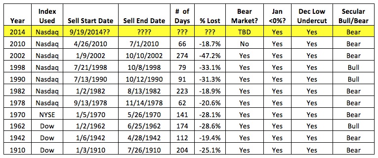
There have been 10 total instances in which the Dow closed in negative territory in January and the low of the preceding December was undercut at some point during Q1 of the given year (11 total including 2014). Comparing the deepest correction in each of those years yields an unsettling finding—the average market correction in a midterm election year with the 2 aforementioned criteria met was a drop of -27.1%.
Filtering the list even further and highlighting only markets that existed within a secular bear market (which I think we’re still in—more on this to follow), the average loss across 7 instances was -25.4%. Also worth noting is that the shallowest correction in a midterm election year with both the January indicator and the December low indicator met was -18.7%. 2014 has a nasty drop ahead if it’s going to even remotely achieve a selloff of this proportion, especially considering we’re already entering Q4.
Decennial Pattern
The Decennial pattern is a tool suggesting years ending in the same digit have some utility in gauging what the market is apt to do. If you were to look back on the Nasdaq, S&P 500, and Dow Jones at every year ending in a ‘4’ (i.e. 2014, 2004, 1994, 1984, etc.), you’d notice that ‘4’ years appear to be magnets for cyclical bear markets (i.e. 20% corrections over short periods of time). Even more interesting is that for the ‘4’ years that experienced sharp corrections, said corrections were always completed by mid-December, and an uptrending market was either spawning or already in full swing by the close of the year in question. A look at years ending in ‘5’ (i.e. 2015, 2005, 1995, etc.) throughout history reveals there has never been a cyclical bear market (correction >20%) during one of these years. Some ‘5’ years have been a bit choppy, but in aggregate, ‘5’ years have been solid years for the market.
Given that our thesis involves an aggressive market correction at the end of this year, the Decennial pattern would seem to suggest that any cyclical bear market to hit would need to be completed before the start of 2015. This means our window for the correction would now be narrowed to 3 short months (October, November and December 2014). Looking back over the last 110 years of potential ‘4’ Decennial patterns (11 total instances), 8 of the 11 had considerable corrections occur starting/into December. Of those 8 instances, 7 hit their lows before Christmas, and 1 hit after Christmas. The average of all instances has the bottom hit by December 16th (pretty wild that the Fed has a statement and Q&A with Chair Yellen on 12/17/14, huh?).
Crash Cycles
The below charts are examples of various periods throughout history whose correlation to current market action are high enough to warrant further study. You’ll note that each of these periods is what I’ve termed a ‘Waterfall Selloff’ or a ‘Crash Cycle’ during which the market, after rising strongly for a lengthy period of time, suddenly breaks sharply, confounding investors and pundits alike.
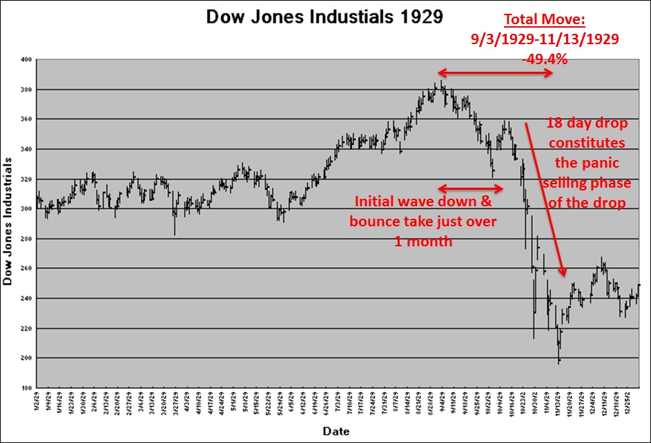
First up is a chart of the 1929 market leading up to the September peak, and the ensuing collapse forever known as the Great Crash. The Dow Jones hit its peak on 9/3/1929, and then proceeded to shed 49.4% of its value over the following 2 months through 11/13/29. The astute observer will note the majority of damage was inflicted between 9/3/29 and 10/28/29. On the chart below, you’ll see that the index had an aggressive bounce near the end of October that was barely undercut in November. With that said, the number of calendar days from peak to October low was only 56, during which the lion’s share of the Great Crash damage was done. While the index didn’t officially bottom for about 2.5 more weeks, the real gains (or losses for those less fortunate) from this downside move occurred in the 18-calendar-day stretch from mid to late October 1929.
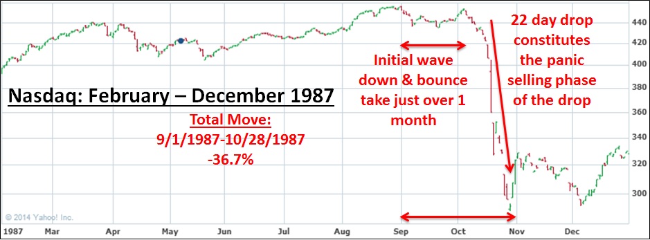
Next up is the only other worthy comparison we’ve been able to find that accurately reflects our current market in 2014—1987 right before that massive market collapse. From 9/1/1987, the Nasdaq lost 36.7% of its value by 10/28/1987, before stabilizing and managing to run higher over the next 2 years through 1989. Similar to the 1929 precedent, the entire 1987 move happened in just 57 calendar days, which is also oddly similar to 1929 (56 days, as noted above). Crash cycles tend to repeat themselves and the bulk of damage from these cycles is found in the same relative neighborhoods for a reason—human psychology. The bulk of the 1987 Nasdaq crash happened over a 22-calendar-day period in October 1987, while the 1929 precedent saw the bulk of the crash inflicted in 18 calendar days. The similarities are striking.
The 56/57 calendar day periods for the core of both corrections from our precedents above can be extrapolated for 2014. Taking what we’re identifying as the 9/19/14 top and adding 56 calendar days yields 11/14/14 as a potential ending point to the carnage that Thomas and I envision to already be underway (if 1929 holds, a few weeks of choppy action could presage a December 2014 turning point).
Also of note is that both crashes took just over 1 month from their peak to the top of a short rebound after the initial selloff (1929 = 1 month, 8 days; 1987 = 1 month, 5 days). In 2014, this would indicate to us that the market peak, 9/19/14, plus 1 month and say 5 days (to match the shorter 1987 precedent) would suggest the strongest collapse activity not commencing until around 10/24/14. From the bounce peak, the following 18 (1929) to 22 calendar days (1987) brought the true waterfall selling, both the real damage and the real profit opportunity for those gifted with foresight and ability to short the market. We’re chasing after that elusive waterfall, the exact action that will earn this impending collapse our designation as the Great Crash of 2014.
So let’s now model 2014 in full based upon our above precedents. If we’re correct, a bull market peak was reached on 9/19/14. If the 1987 precedent were to hold with the number of trading days in each wave (let’s break the action of the correction into 3 waves: A-B-C), then we’d get the following result in 2014: 9/19/14 market top + 14 trading sessions to low of first selloff = estimated 10/9/14 low (wave A). 10/9/14 low + 10 trading sessions for upward burst = 10/23/14 (wave B) estimated peak. Notice that this would achieve the A-B pattern being greater than 1 month, as outlined above. Finally, we’d have 10/23/14 + 16 trading sessions = 11/14/14 (wave C, the ‘Crash Cycle’ low). The most violent action of this entire wave series is the final 16 trading sessions in wave C, which in 1987 corresponded to a 36.4% drop on the Nasdaq.
Completing a similar exercise with our 1929 alternative, our market top on 9/19/14 + 23 sessions = 10/22/14, which would be the low of wave A. 10/22/14 + 5 trading sessions = 10/29/14, the peak of wave B. Finally, 10/29/14 + 12 sessions = 11/14/14 (wave C, the ‘Crash Cycle’ low and the exact same date produced performing the 1987 analysis.) In 1929, the Dow fell over 40% in these 12 trading days alone. It’s also worth noting that the 1929 precedent had a final bounce and selloff lasting 11 sessions after the major low, so 11/14/14 + 11 trading sessions = an estimate of 12/2/14 as the potential market bottom under this scenario (aligning closely with other historical items explained above).
Regardless which precedent scenario most closely mirrors our coming event, what we’re demonstrating is that 2 notorious historical crash cycles shared extremely similar timing, which aligns perfectly with our larger roadmap. The real fireworks (i.e. the crash) should hit in the final week of October and first 1-2 weeks of November, continuing through somewhere around the Fed minutes release on November 17th. From there, the market should likely chop around into December 2014, before calming down early-mid month (think of the excessive foam or debris cloud after a waterfall). Investors should hold onto their knickers after that point, as we’re looking for the market to explode higher over the next 1.5 to 2 years through the ultimate bull market peak (see our Investment Roadmap below for a longer-term outlook).
Anyone reading this should note that the analysis we have presented in this section is purely educational—there’s no guarantee that the story will play out exactly as we envision it based upon historical precedents. Recall that the reason we do precedent analysis is to help us develop a feel for the prospective risk-reward scenarios that exist in the market at any given point. As of this writing, the evidence calls for a high degree of caution in our current market environment. The variety of factors that Thomas and I analyze are all consistent with this warning status; despite the indexes being near their bull market highs, something not-quite-right is transpiring beneath the market’s apparent strength. At some point, this veil of artificial strength should be lifted and the market’s true colors will be revealed. We caution you to heed our warning and limit your potential risk accordingly.
Investment Roadmap
In February 2014 we outlined our roadmap for the market over the next 6 years. We understand this is a bit bold if not extremely unconventional in the asset management industry, but regular readers of this commentary should understand our philosophy of why it’s helpful to construct a forward-looking projection of capital market behavior. As the mantra goes: History doesn’t exactly repeat itself, but it often rhymes, and those who forget history are doomed to repeat it. We plan to continually update the roadmap with new information as the market presents it to us. By no means do we expect markets to play out exactly as we’ve outlined—rather, this type of analysis simply helps us understand where and when the best risk/reward ratios are.
Here’s our roadmap with a few updates from this summer. We’re still looking for a bull market peak in 2016 (for the bigger bull cycle that started in 2009), followed by a 22 to 36-month bear market to reset investor expectations before a strong secular bull market begins. Next time around, we’ll demonstrate in our History & Precedent section how the length of a bear market immediately following a prolonged bull market (like our current bull market) follows a consistent pattern: 36 months (1881-84), 22 months (1919-21), 36 months (1946-49), 22 months (1980-82), 36 months (2016-19??).
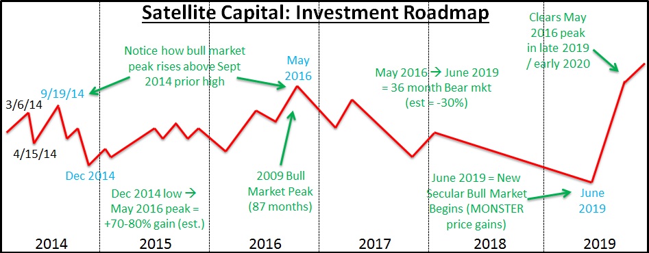
The above will be constantly tweaked as new information presents itself. Our roadmap helps us apex the market’s major turns by keeping the larger design of the market’s racetrack in mind. This larger framework is what’s important, because it’s a factor in how much risk we are willing to undertake at a given time. We remain ready and willing to change any or all of our conclusions from the above analysis as more market information presents itself. A huge component of our risk management activity is being extremely rigid with our investing rules, and very flexible with our expectations. Our job is not to predict, but to interpret. We interpret current market action and adjust our positions accordingly. We do not condone an investor using this roadmap as anything more than educational input, as we could change our positioning on a dime (and will if the market tells us we need to).
Conclusion
With all the bearish banter above, what are we left to do? Thomas and I recommend selling anything that you have invested in the equity markets through the end of 2014. If the doomsday scenario discussed above does come to fruition, the best play is to not play at all. Protect your capital. By reaching the end of this commentary you’ve demonstrated interest in your financial position, and we implore you to be defensive and shift portfolios to either cash or short-term government bonds. Remember, we’d rather be wrong and safe than wrong and invested long in the market during a 20-30% correction.
When the Great Crash of 2014 does come, it should leave in its wake the buying opportunity of a lifetime. Those who opt to be conservative and protect themselves now will have a large reserve of cash to buy back drastically oversold equities in December 2014. Our roadmap above should communicate how strong a performance the market could put forth through 2015 and 2016. Even though media pundits are hyping the potentially devastating effects of the Fed hiking interest rates, I’d note that the first rounds of rate hikes generally tend to accompany higher equity prices. Only when the Fed has gone too far, too fast do the market and economy get into trouble (exactly what we anticipate happening in mid-late 2016). Cycle after cycle, these patterns repeat themselves. Don’t get caught on the wrong side of history.
Regardless of what the next few months bring, our top objective remains first and foremost the preservation of our partners’ capital. Generating a steadily rising equity curve is of secondary importance to protecting the assets we‘ve already been entrusted to manage. Future posts will be in quarterly increments, so we’ll see you in early January with commentary on 2014’s Q4 action. We hope you have a great rest of 2014! Please stay safe!