As was widely expected at Ben Bernanke’s last FOMC Meeting as chairman, the Federal Reserve will taper an additional $10B of bond buys per month, such that it’s now buying $35B per month of Treasuries and $30B per month of mortgage-backed securities. The $10B monthly reduction aside, the Fed is still pumping $65B of stimulus into the economy monthly, which is extremely accommodative towards the ongoing U.S. recovery. Most market pundits argue that the Fed will continue to cut $10B from its monthly bond buys until the purchase program ends in either Q3 or Q4 of this year. Considering the Fed only meets 8 times per year, a monthly reduction of $10B would mean and end for the program around the October 2014 FOMC meeting (though more likely the July or September meeting).
The other big Fed news is that Janet Yellen will take over the reins on February 1st as the first female Chairperson of the Fed. While most market pundits argue Yellen is extremely dovish (i.e. more likely to keep the proverbial liquidity needle in the economy for longer than required to ensure no backtracking occurs), we expect Yellen will be extremely data-dependent and base decisions purely upon the numbers put in front of her. We suspect Yellen may even make a data-driven decision or two at some point in 2014 that could shock the markets. Perhaps she will taper more than $10B per month (March/April?), or even end the asset purchase program early (July?). Time will tell.
Economic data in January was generally positive, notwithstanding a few speed bumps throughout the month. December non-farm payrolls came in at +74K versus expectations of +200K, November payrolls were revised higher from +203K to +241K, the official government-reported unemployment rate (U3 in econ geek speak) fell to 6.7% from 7.0% in November, and the labor force participation rate dropped again to its lowest level since 1978 by hitting 62.8% (this percentage was also reached in the October 2013 release). The first reading for Q4 GDP growth came in at +3.2% versus expectations for +3.0%, and Q3 GDP growth was again reported at 4.1% (no change from the prior estimate). In spite of the statistical blip that was the December jobs report, the economic recovery still appears to be strong. One thing to keep in mind regarding this jobs number is that there have been 6 instances of <100K payroll growth over the past 5 years, and 5 of those 6 instances had significantly higher revisions over the next 2 months.
Leading stocks had a mixed month in January. Several leaders we’ve profiled held up well despite choppy market conditions, and a few even made solid progress. That said, January brought several more breakdowns than breakouts among leaders, tipping the scale towards a higher risk, lower reward-type environment. Breakdowns in stock leadership and market breadth are usually the first hints we get before broader market declines take hold. Jesse Livermore, a legendary market investor from the early 20th century, said that the time to sell stocks short is not on the initial move, but after the reaction. Livermore observed that there’s almost always a bounce after sharp breaks; given that several leaders experienced sharp breaks in January, identifying which stocks aren’t able to recover their leadership (i.e. make new highs) will be key to determining which stocks are likely to get crushed during an ensuing downtrend. With several leaders still acting strong and several others breaking down, caution is warranted into February. The emergence of further divergences or weakness could prove deadly for overexposed investors.
This month we’ll break our market analysis down into our usual 4 pillars of market health: 1) The action of the indexes, 2) The action of the best leading stocks, 3) Sentiment & Psychology-based indicators, and 4) Historical precedent action. Remember that Thomas and I place the most weight on pillars 1 and 2 (our primary measures of market health) when performing our analysis. Pillars 3 and 4 are important, but are secondary indicators in nature and need to be treated as such.
I’m going to dive right into analysis under the assumption that readers of this commentary have read our previous installments and have developed a basic understanding of our approach to the market. For first time readers, I recommend reviewing our February 2013 Commentary and earlier to ascertain a detailed explanation of why we at Satellite Capital examine what we do, and why we are interested in certain stocks over others. And as always, please don’t hesitate to contact Thomas or myself with any questions.
Indexes
For the month of January, the Nasdaq fell 1.74%, the S&P 500 shed 3.56%, and the NYSE Composite cratered 4.16%. This marks the first monthly loss for leading indexes since August, snapping a 4-month win streak. During the final days of January, the NYSE and the Dow undercut their December 2013 selloff lows, while the Nasdaq and the S&P 500 were able to hold above those prior lows. This is a noteworthy divergence that could prove to be an important hint regarding the overall market direction over coming months. Of course, it could also be nothing at all, and the Nasdaq and S&P 500 could match the NYSE & Dow action in the coming days/weeks. Such is the ambiguity that accompanies many divergences, but those investors proceeding with heightened senses are often rewarded at such junctures. We favor the ‘significant-until-proven-otherwise’ approach to divergences of all types.
Distribution was clearly present throughout the month of January. Recall that we define distribution days as trading days on which the indexes fall at least 0.2% in higher volume than the prior trading day. Generally 5-6 clustered professional selling days gives a hint that the supply/demand dynamic has shifted in favor of the supply side, which is dangerous for prices. When supply increases with no change in demand, prices must fall. Last month, the Nasdaq, the S&P 500, and the NYSE each picked up 8 professional selling days. Although the market is often near a bottom when distribution reaches such an elevated count, it’s essential to monitor which way the scale is tipping to help assess how a portfolio should be positioned.
Over the last few months, we’ve been closely watching the action of the NYSE Composite in regards to its all-time high. On the very last trading day in December, and with absolutely zero press (and I read a lot of financial publications), the NYSE Composite finally reached a new all-time high. After that feat, the index executed a tailspin throughout January, shedding 4.1% for the month. This lines up nicely with the 1979 precedent we’ve been watching, in which the index poked into new high ground before getting swatted down on 2 different occasions (an 11.3% dive in October 1979, followed by a second 20.8% dive in February/March 1980). While the NYSE is reeling sharply from its recent all-time high in the very short-term, it should move to new high ground in the coming month or two before getting swatted down again. This type of action serves to shake out those investors getting too aggressive on either the long or short side of the market.
In summary, the indexes had a rough start to 2014, and the oft-touted January Barometer is going to have many market pundits screaming about the high probability for a choppy 2014 (given our research beyond the January Barometer, we agree). We cautioned about the need to aggressively protect your downside in last month’s commentary and echo the same sentiment this month. While the indexes will likely rise through the next Fed meeting in March (see Sentiment & Psychology below for why we focus on this exact date), the action at February’s start has thus far painted a change in market character. Be cautious!
Leading Stocks
January was a mixed bag for leading stocks. While many new leaders broke out of early patterns, many more stocks broke down under the weight of the market. A few leaders that were able to make progress in January include: CSIQ, FEYE, FB, IACI, PANW, QIHU, SCTY, TWTR, UA, & WBMD. Leaders that showed signs of breaking down in January include: AAPL, AMZN, ARMH, BIDU, DDD, DRYS, HLF, LVS, PCP, SINA, TW, VMW, YNDX, & X. Both Apple (AAPL) and Amazon.com (AMZN) violated their 10-week moving averages on earnings-induced news, a sell signal that hints further downside action is likely in coming months.
To examine a specific sector, housing stocks roared back in a big way in January. With interest rates falling sharply off recent highs in January (seen as extremely favorable towards housing sector prospects), people are able to borrow at more favorable terms. Here is a snapshot of U.S. Treasury bond action during January: 5-year Treasury note -13.6% to yield 1.51% (from a recent high of 1.8%), 10-year Treasury note -11.8% to yield 2.66% (from a recent high of 3.0%), and the 30-year Treasury bond -8.6% to yield 3.6% (from a recent high of 3.9%).
Because of this weakness in rates, several top housing stocks were able to break out of long consolidation patterns in January: D.R. Horton (DHI- the largest U.S. housing builder) was up 5.2% for the month, Lennar (LEN) was up 1.5%, N V R (NVR) was up 12.4% to a new all-time high, and Ryland (RYL) was up 2.8%. Several other housing stocks are also setting up in long, early stage patterns: K B Home (KBH), Meritage Homes (MTH), Pulte Home (PHM), Standard Pacific (SPF) and Toll Brothers (TOL). It’s interesting to watch how this group dynamic has been playing out in the face of the Fed’s tapering. Market pundits argue that interest rates should rise as the Fed pulls back on its stimulus, but the exact opposite is happening thus far, to the benefit of the housing sector.
It’s important to note that we do not invest in themes at Satellite Capital. Rather, we select companies with the best fundamentals, best future prospects, and best technical action coming from the best market groups to help balance our portfolio. Research has shown that up to 50% of a stock’s move can be accounted for by that of its broad industry and smaller group level. A few housing stocks passed our screens and exhibit the type of criteria we require, and for the time being, have garnered some of our investment dollars. Now, we must monitor closely to verify whether the housing sector can continue to power higher or whether the market’s weight will break its recent spate of strength.
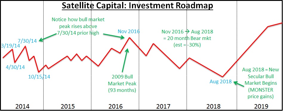
Due to fairly negative recent market action, Thomas and I are updating our 2014 investment roadmap to shift the 10-15%+ correction we’ve been anticipating forward one month, for a revised start on 3/19/14 and completion on 4/30/14 (FOMC meeting to FOMC meeting). This means that selling through January’s close should be followed by a bounce that carries most of the indexes into new high ground in February, with a strong, climactic peak in March. Creating an investment roadmap is important to help determine how much risk one should be seeking at any given moment in the market. Having the discipline to constantly tweak and update the roadmap as new information presents itself is vital. We’re using the information we gained in January to make the assessment that we were likely about a month too early in our assessment of when the indexes should begin a larger correction. Consequently, in the History & Precedent section below I’ll profile a time in history when our 2014 roadmap synced up for an entire year: 1987.
Overall, recent market action has weighed on several stocks from leading groups. When the market weighs down leaders, it’s akin to holding a basketball underwater– the basketball wants to go up because the air in it needs to be displaced by the water, but the force holding the ball underwater (you) is temporarily keeping it down. When you release the ball (i.e. remove the pressure), it rockets out of the pool water; the same is true of leading stocks and the broader market indexes. Most leaders have sustained little technical damage during the broader January selloff, which indicates to us that the 8-week hold rules we discussed last month are still valid and that we should continue holding the stocks we’ve accumulated through at least mid-late February.
Given most leaders’ current distance out of early-stage patterns, we still feel this larger leg of the bull market could continue into Q3, with a possible market top in mid-late Q3. At that time, the market would wring out the majority of price gains made during the prior move upward, and leading stocks would be completely wrecked in the ensuing selloff. We need to be vigilant in our watch for topping signs, and aggressively shift our portfolios in the event that something goes awry and we catch ourselves with more long exposure than is prudent.
While we remain committed to the long side of the market, we critique each day’s market action versus the performance of our individual stocks to determine the best time to exit our positions. This is especially important for our leaders, who earn their title on the downside as well, often leading in their declines before the broader market follows suit. If the indexes’ drop indeed commences in late March at the Fed meeting, we assure you we’ll cut our long holdings and position ourselves on the short side of the market, at least for a brief period of time. Until that time, risk management remains our primary focus, and cutting losses quickly while letting winners run is key to unlocking strong returns.
Sentiment & Psychology
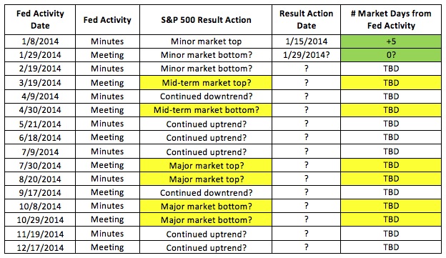
January has again demonstrated how the market will often sell off before a major ‘negative’ news announcement, and then bottom around the time that news becomes officially known. As discussed above, another $10B was trimmed from the Fed’s monthly purchase quota at the January FOMC meeting, taking the new monthly purchase total to $65B starting in February. The market sold off into the FOMC announcement on 1/29/14, with the Nasdaq and S&P 500 having reached bottoms that very day (thus far), while the NYSE and the Dow made new lows on Friday (+2 days to FOMC Statement day). While the market could continue lower into the first week of February, we’ve seen pretty significant downside pressure already, and many indicators are now hinting to us that a rally is nigh.
This month I’ve removed the 2013 portion of our Fed study table (see last month for the recent update), and have kept the 2014 portion with updated known activity as of 1/31/14. Recall that our table below has the 2 key Fed activities captured as significant, market-moving events: the FOMC statement (issued on the last day of the FOMC’s 8 meetings per year) and the meeting Minutes (published exactly 3 weeks after meetings transpire). Also recall that on the table below, directional market changes that can be traced to within 5 days of Fed activity are highlighted in green. Items in yellow could either not be traced to Fed activity, or were more than 6 market days away from the corresponding Fed activity. While correlation doesn’t necessarily lead to causation, every astute market observer is aware of the profound effect the Fed has on the economy through the various policy tools it employs.
On the table below, I’ve updated the first 2 Fed activities for this year, and have placed our best educated guesses as to how the market will respond to future activity in 2014, given our investment roadmap (see the Conclusion section for a 10-point map and chart of how we currently envision the next 6 years of market activity).
As discussed last month, market sentiment (as measured by the Investor’s Intelligence Bulls versus Bears survey) continues to be excessively optimistic. The ratio of Bulls divided by Bears been better than 3.5-to-1 for almost 2 straight months. The last time this ratio hit higher than 4:1 and sustained such a level for any length of time was in early 1987. Such has been the case through late 2013 and into January 2014. Coincidentally, the action of the 1987 market is lining up nicely with our 2014 investment roadmap, as I will discuss in the next section.
Other measures of sentiment and psychology, such as the NYSE Advance/Decline line and comparison of new highs versus new lows, continue to be favorable towards a continued market uptrend, despite weakness in the latter half of January. The overbought and oversold ratings, which are calculated by taking a moving average of the A/D lines, are also reaching moderately oversold levels that have coincided with other market selloff bottoms.
Overall, measures of sentiment & psychology are secondary in nature to actual index and stock behavior. We can use these measures to help us gauge the risk/reward relationship in a given market environment, but the action of our stocks as they relate to the that of the broader indexes is the best guide to help us allocate this ratio. While our investment roadmap can also help us assess prospective return scenarios, the actual activity of indexes and leading stocks remains our primary cue.
History & Precedent
This month in History & Precedent we are going to A) examine a precedent period that, as mentioned, happens to line up with our Investment Roadmap (see the Conclusion section for the full roadmap) and, B) detail the results of the Midterm Election year study that we promised last month. Please remember that like Sentiment & Psychology, all History & Precedent analysis is secondary in nature and that we take our primary cues from the action of indexes and leading stocks. This analysis can help us better understand the environment within which we are investing, and help us gauge how much risk we may or may not be wise to take in a given situation.
1987 Nasdaq Precedent Study
Given the current similarities regarding extreme bullish sentiment not seen since early 1987, this month we wanted to look at exactly what transpired during 1987. We’ll ask you to then compare 1987’s action as displayed on the chart below against the roadmap we’ve been envisioning for 2014. We drew our roadmap many months ago (completely independent of this precedent), and only recently decided to do the comparison.
On the chart below, I want to highlight a few key things. First, the Nasdaq ran up through mid-late March 1987 before hitting a short-term top, and then proceeded to sell off for approximately 1 month until April 27th in the NYSE’s case (April 27th for the Nasdaq). Recall that in 2014, we’re looking for a market top near the Fed’s March FOMC meeting (3/19/14), followed by a 10-15% selloff through the April FOMC meeting (4/30/14).
Second, the 1987 index moved higher from its April/May lows through its late August/early September peak, and then proceeded into a free fall selloff during the 1987 market collapse. Drawn in blue on the chart is what’s known as an Elliott Wave (see any prior commentary over the last 4 months to get an explanation of what this is). Given that this was a 3-wave pattern (A-B-C), this marked an important ‘Down 4’ selloff for the larger bull market that started in August 1982. Our 2014 roadmap currently has the indexes running higher from their April 2014 low through the July FOMC meeting (7/30/14). From there, the indexes would collapse 20-40% over the next 2.5 months, into early October 2014.
Finally, the 1987 Nasdaq went into rally mode from October 1987 through the bull market’s ultimate peak in October 1989 (Elliott Wave ‘Up 5’, not pictured). Our roadmap has the indexes bottoming in October 2014 and running higher through approximately November 2016 (2 years, 2 months), at which point the market would hit its ultimate bull market nadir (conveniently, also Elliott Wave ‘Up 5’ for our current larger bull market).

I should point out again that we’ll happily change any or all of our conclusions from the above analysis as new market information presents itself. A huge component of our risk management activity is being extremely rigid with our investing rules, and very flexible with our expectations. While the precedent above conveniently lines up with our current roadmap at the moment, it certainly doesn’t have to play out exactly as painted above, or below in the Conclusion section. “History never repeats, but it often rhymes” is a mantra to keep in mind as we weigh this type of analysis.
U.S. Midterm Election Year study
As 2014 is a midterm election year, now we’re going to dive into a study of every midterm election year since 1902 (28 total instances), as promised in last month’s commentary. A midterm election year occurs 2 years after a presidential election (in the middle of his/her term). For example, President Obama was elected in 2008, and the subsequent midterm election year was 2010. He was then re-elected in 2012, making 2014 a midterm election year. For our study, we took what we consider to be the leading index of each era (Nasdaq/NYSE/Dow), and then noted the market action during those midterm election years. Specifically, we were interested in whether any significant selloffs of more than 10% (or multiple selloffs of >10%) occurred during these midterm years.
The table below records the single most significant selloff during each year indicated (if there were multiple only the deepest is shown), and only examines market action within that calendar year. For example, while 2002 was a midterm election year, the bear market started in March 2000 and continued through October 2002. Hence on the table below, I started the ‘Sell Start Date’ at the highest point the index reached before the selloff started that calendar year.

As you can see from the table above, 25 out of 28 midterm election years since 1902 have brought at least 1 correction of 10% or more. Not shown above, but calculated were 5 instances that had 2 corrections of >10% during that midterm election year. Also not shown, but determined was that 17 of our 28 instances (60.7%) were associated with a bear market either taking place into the midterm year, or during the midterm year itself.
We also looked at the ever-popular “January Barometer”, which asserts that if the Dow has a negative return for the month of January, so goes the rest of the calendar year. Of the 25 instances with 10% or greater selloffs in our above analysis, there were only 10 in which January produced negative returns on the Dow Jones. While not interesting and not particularly significant on its own, 9 out of the 10 negative January instances in question found the market in bear territory sometime during that midterm election year.
So where does that leave us in 2014? The likelihood of a >10% selloff is extremely high, given the odds calculated above in our study (25/28 instances). And the Dow definitely had a negative return in January (as did the Nasdaq, for those preferring a more contemporary index), so the January Barometer is flashing a high likelihood of a >20% bear market correction sometime during 2014. Lastly, the odds in our study follow suit, indicating that a bear market scenario could unfold during this calendar year (17/28 instances looked at were associated with bear markets).
What we know for certain is that 2014 has already kicked off in a choppy fashion. Given the precedent of midterm election years with associated negative January Barometer readings, there’s a very high likelihood 2014 is going to be nowhere near the smooth ride 2013 was. As usual, these indicators and the associated analysis are secondary in nature to that of the action of indexes and that of leading stocks. What the above analysis can offer us is some conviction to identify situations consistent with our roadmap, so we can best position our portfolios to maximize returns where those returns are available.
Conclusion
In summary, January was a rough month for the indexes and many leading stocks. Thus far, it appears the Nasdaq and the S&P 500 hit their nadir on the day of the FOMC announcement (January 29th), but the damage done to the indexes over the week or so leading up to the announcement was enough for Thomas and I to shift our 2014 roadmap by a single month. Combining our analysis of everything discussed above and a few things we didn’t have time to get to this month, here is what we are now envisioning in 2014 and beyond:
1. The market has either already hit bottom in January or will hit bottom within the first few days of February.
2. From that point, the indexes will rally to new bull market high ground through the March FOMC Meeting (3/19/14).
3. The market will then sell off for roughly 1 month to the April FOMC meeting (4/30/14).
4. The market will rise again to new high ground over the following 3 months until the July 2014 FOMC meeting (7/30/14), at which time a major market top will be set.
5. A major market selloff (more than 20%) will start in August and continue through October 2014.
6. The market will hit bottom in October 2014 and then enjoy a strong end-of-year rally. November and December should be excellent months to be invested on the long side of the market.
7. The strength exhibited should continue through 2015. No year that ends with a ‘5’ in the history of the stock market has been a bad year (yet). We think this trend will continue for now, despite a minor setback or two during the year.
8. The market will continue higher into 2016, with the occasional hiccup. A major bull market top will be set in November 2016, ending the bull market that started in March 2009.
9. We are currently modeling a 30-35%, 20-month-long bear market from November 2016 through August 2018.
10. A new secular bull market will begin in August 2018, and strong gains can be expected into early 2020.
Just to be unequivocally clear, I want to reiterate: Our job is not to predict, but to interpret. We interpret current market action and adjust our positions accordingly. As stated above, the roadmap will be constantly tweaked as new information presents itself. Our roadmap helps us apex the market’s major turns by keeping the larger design of the market’s racetrack in mind. This larger framework is what’s important, because it’s a factor in how much risk we are willing to undertake at a given time. As always, strict risk management policies are extremely important to protect against serious investment losses.
If we are right in our revised assessment and the market has indeed hit bottom by the end of January or the first days of February, seeking heavy market exposure from early February through the middle of March is the likely optimal play. More information will be needed to assess this, but at least in the meantime, some exposure to the long side of the market is warranted.
Gauges of market sentiment and psychology are still flashing signals of excess not seen since 1987, which is why I wanted to share that precedent with you in the History & Precedent section above. Given the shift in our market roadmap, the 1987 precedent now actually aligns nicely with our revised 2014 roadmap. We find this somewhat curious, but the likelihood of generating the same resultant action is entirely within the realm of plausibility.
We’ll be back in early March with our commentary on what we expect to be a remarkable month for the market. Have a great February!