A number of different things catalyzed the market in November: a very strong jobs report from October, better than expected earnings reported, the generally positive Fed minutes released on November 20th, and preliminary Black Friday indicators demonstrating solid consumer spending likely to transpire over the holiday season. Given this positive backdrop, the indexes’ performance and that of elite stocks were worlds apart.
In keeping with last month’s theme, leading stocks largely continued the consolidations they began in October. While many leaders remain in correction, a few have perked up and traced attractive chart patterns. As long as a fresh crop of leading stocks exists to power the indexes higher, the other leaders can take a breather and consolidate. While we’re still envisioning a one-month 10-15% decline in the near future (likely the month leading up to the official taper announcement), the current action of stocks and indexes tells us to side with the bulls. We’ll expound on our views regarding current action below, and posit a few ideas involving our recent research.
This month we’ll break our market analysis down into our usual 4 pillars of market health: 1) The action of the indexes, 2) The action of the best leading stocks, 3) Sentiment & Psychology-based indicators, and 4) Historical precedent action. Remember that Thomas and I place the most weight on pillars 1 and 2 (our primary measures of market health) when performing our analysis. Pillars 3 and 4 are important, but are secondary indicators in nature and need to be treated as such.
I’m going to dive right into analysis under the assumption that readers of this commentary have read our previous installments and have developed a basic understanding of our approach to the market. For first time readers, I recommend reviewing our February 2013 Commentary and earlier to ascertain a detailed explanation of why we at Satellite Capital examine what we do, and why we are interested in certain stocks over others. And as always, please don’t hesitate to contact Thomas or myself with any questions.
Indexes
For the month of November, the Nasdaq rose 3.5% and the S&P500 climbed 2.8%, marking the third straight month of gains for each index. Another notable streak is that the S&P500 has risen for 8 straight weeks as of November’s close. Heavy selling days have been minimal throughout the month, with the Nasdaq counting only one day and the S&P500 counting zero (recall that 5-7 heavy selling days can help signal a market top). Both indexes powered to fresh bull market highs and, as mentioned, have cleared large round numbers (4000 & 1800, respectively) at least for the time being.
Similarly, last month I discussed how the NYSE Composite index had yet to notch a fresh all-time high. As of the very last day of November, the index was able to reach a fresh bull market high before reversing late in the session on Black Friday. Despite this move, the index still remains 1.5% below its all-time high of 10,387, set in October 2007. Last month I demonstrated the precedent of how the NYSE has historically had difficulty breaking into new high ground at this stage of a bull market move. A new all-time high for the NYSE is likely in the coming month or two, but the index has definitely been struggling to make progress as of late, whereas the Nasdaq and S&P500 have coasted higher.
Despite the strength being exhibited by the Nasdaq and the S&P500, the Russell 2000 is demonstrating much weaker action, as the index prices moves higher while its relative strength line is plugging lower. We wouldn’t be surprised to see the Russell 2000 drop sharply from its new highs into the 1065-1080 range in early December before moving to new highs one final time (before a larger selloff). If this does indeed play out, the 10-15% correction we’ve been envisioning would likely commence within mere days. This could transpire as early as the Fed meeting later this month, or as late as the Fed meeting at the end of January 2014. The drop would likely end somewhere between 850 and 950, based on various gauges Thomas and I use.
To close verbatim from last month: “In summary, the indexes are looking quite strong at month’s end, with fairly low levels of distribution. Despite the apparent strength, several divergences have appeared which give us some concern. A trend can and will often continue longer than one would expect. Given the current strength being exhibited, the action of the indexes guides us to be cautiously long in only those stocks holding above proper entry points.“
Leading Stocks
November was yet another month to forget for most leading stocks. Recall that we consider a ‘leading stock’ to be one with the strongest fundamentals (big earnings growth, sales growth, return on equity, cash flows, etc) and an equally impressive technical picture (strong prior uptrends, rising on increasing volume and falling on decreasing volume, etc). We also look for a disruptive driver at the companies we follow, such as LinkedIn and disruption of the professional identity market, or Tesla and the entirely electric car. While the indexes have been able to keep plugging higher and higher, most leaders are either stuck in neutral or headed lower (only one stock of the 6 we discussed last month managed a nice gain in November). Our 5 core leaders + YELP (which we discussed last month) performed as follows: CELG = +8.9%, FB = -6.3%, LNKD = +0.1%, QIHU = -1.3%, TSLA = -20.4%, YELP = -10.4%.
Given the strong run that each of these 6 stocks has experienced throughout most of 2013, some consolidation at this stage is to be expected. The worst performer of the 6 for 2013 is FB, with a 67.8% return through 11/30. The best performer is TSLA, with a 259.9% return. All 6 have basically been trending lower or sideways since mid-October. Despite our core leadership moving sideways, there are still other stocks that possess our desired criteria and are also forming constructive chart patterns, and therefore could be buyable in the near future. Some of these include PII, TW, UA, LVS, PANW, and YNDX. Given how far we are into this bull move, our holding periods are likely to be much shorter (no more than 6-12 weeks) versus a stock like LNKD, which we’ve held since January.
Overall, with our core leaders building consolidation patterns, all appears to be fine for now. A fresh crop of stocks has emerged and is setting up nicely for what could become profitable moves over coming weeks or months. We remain committed to seeking out the very best merchandise at exactly the right price to help us minimize any downside risk. While we encourage you to look at each of the stocks mentioned above, we strongly caution against buying and holding without abiding by proper buypoints and rules. There’s a right and wrong time for everything, and being able to judge the correct time is a huge advantage for those able to employ restraint and act on their interpretations. The action of indexes and leading stocks indicates for now that more upside is likely into the year’s end. 2013 will undoubtedly go down as one of the best bull market years in history, and our crop of stocks tracked above has experienced mostly smooth sailing all year long. 2014, on the other hand, will likely bring choppier waters.
Sentiment & Psychology
This month I’m going to change things up a little. Rather than highlight a few indicators that are flashing various signals, I’m going to talk about the market sentiment and psychology generated as a result of the U.S. Federal Reserve’s actions. 2013 has seen many market directional changes, and understanding the Fed’s effects on capital allocation decisions is extremely important. In the table below, I’ve noted the major FOMC activities throughout 2013 (both the dates that the meetings concluded as well as the date the minutes were released). I then outlined the market’s move that could be discerned based on the Fed’s action, what date that action started, and how many market days from the Fed’s action before the corresponding move commenced.
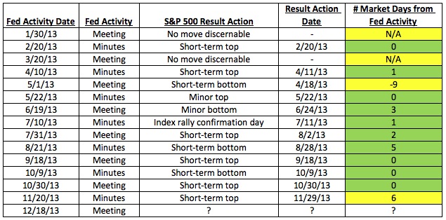
From the table above, the numbers of days highlighted in green represent moves that can clearly be traced to Fed activity within 5 days of that move. Items in yellow could either not be traced to Fed activity, or were more than one market week away from the Fed’s activity (there are 5 trading days per week). As you can see, of 16 instances this year, the 12 green instances represent 75% of the total shifts in the market. While correlation doesn’t necessarily lead to causation, every astute market observer is aware of the profound effect the Fed has on the economy through the various policy tools it employs.
Often times by utilizing technical analysis (i.e. reading what the market is telling us and not what the media is saying) we can figure out beforehand what is the Fed is likely to do. While not an exact science, Thomas and I correctly concluded that the Fed would not start its bond tapering in September, as was widely expected at the time. The clear market strength into the Fed meeting demonstrated that more and more institutional players, the primary drivers of market prices, understood that the call for tapering was premature. Fed analysis used in combination with many other tools is a useful way to help allocate a portfolio. In November 2012, the Fed released its minutes on Wednesday the 14th, when the market had been in a near two-month slide. Just two days later (Friday, November 16th) we identified what we call a rally day (aka a bottoming day after a market selloff) and we started moving long that very afternoon.
Understanding how the Fed behaves and its likely responses to market action is very helpful in understanding the sentiment & psychology of a given market environment. I would recommend you pick up a copy of Marty Zweig’s 1986 book ‘Winning on Wall Street’ to get a clear picture of how professional investors look at the Fed’s actions. To get an even older but still relevant perspective on the action of the Fed (from 1964), check out Burton Crane’s ‘The Sophisticated Investor’. I promise you won’t be disappointed.
Given everything discussed above, where does that leave us in our current market environment? When exactly will tapering start? The short answer is we don’t know for sure, but a market selloff in advance of the taper announcement is likely. And then, as we saw above, a market bottom should theoretically happen the day of or shortly thereafter the announcement, and the indexes should be off like rockets to higher ground. The psychology behind this is that the news is always worst at the bottom, because many institutional investors have foreseen what was going to happen before it happened. Then, when the event happens, the selling pressure finally evaporates and the market is again free to move higher.
If we had to venture a guess, we think the market will either top on the December 18th Fed meeting, the January 8th minutes (from the December 17-18th meeting), or possibly as late as the January 28-29th meeting, given the analysis shown here and based on a few other tools. As usual, time will tell. We’ll let the action of the market dictate how we should respond.
One final reminder is that sentiment and psychology-based indicators are secondary in nature. The most important action is by far that of the indexes and leading stocks. Both Sentiment & Psychology and History & Precedent can help us work towards a deeper level of understanding of a given market environment, but we need to cement in our minds that they are of secondary importance. While the importance of the Fed cannot be understated, we need to be cognizant that there are many factors at work in the market, and the best we can hope to do is use our dashboard of indicators to guide how much risk we assume in a given market environment. Keep watching how the market responds to the Fed’s statements, press conferences, and meeting minutes over the coming year.
History & Precedent
This month I’m going to follow up on my promise at the end of October’s H&P section to demonstrate some precedent analysis for what an Elliott Wave Down 4, Up 5 combo could look like over the coming months (i.e. Down 4 would be the selloff leading up to the tapering announcement, while Up 5 would be the resulting rebound afterward). As described last month, Elliott Wave analysis holds that any major market move higher is comprised of 3 up moves, interceded by 2 down moves (i.e. Up 1, Down 2, Up 3, Down 4, Up 5). At the end of a 5-wave up cycle, the market shifts into a 3-wave or 5-wave down cycle (i.e. Down 1, Up 2, Down 3, Up 4, Down 5), before then moving into another up cycle. Performing this analysis successfully in real time is very much an art, and not a science.
We’ve referenced the analysis this month because of the importance of what we’re seeing given our current position in the market. Please also recall that we do NOT make investing decisions based on the analysis in this section. We perform this analysis because certain characteristics of cycles tend to repeat themselves. So this information ultimately helps us understand various phases of a market cycle better.
Onto the analysis: On the below 2 charts highlighting the move leading up to the market peak in October 2007, I’m going to combine the discussion from Sentiment & Psychology above (analysis of how the Fed has a distinct impact on market moves) in combination with how a Down 4, Up 5 Elliott Wave combo leads to a market top.
First, on the chart below you can see that I’ve labeled 3 very specific actions by the Fed over the 3-month time period between July and October 2007. After solid gains since March 2007, the Nasdaq powered higher into late July, when the June 27-28 Fed meeting minutes were released. On the exact day of the release, the index notched its apex and started moving into a downtrend (purple line marked ‘Down 4’). Interesting to note of this downtrend and something common of all Down 4 patterns is the recurrence of a clearly defined A-B-C pattern within the Down 4 move. I assure you this happens on all correctly labeled Down 4 moves.
After a sharp selloff into mid- August, the index bottomed on a special conference call held by the Fed, and then proceeded to track higher into the ultimate October 2007 peak. A key note from this move is that the index had a brief correction before making a new bull market high (not marked, but look to the right of the Up 3 peak / Down 4) and then powered into new bull highs before topping and shifting into a bear phase (lasting from October 2007 to March 2009). I marked clearly on the below charts that the indexes barely moved into new high ground (usually by no more than 5% above the Up 3 peak). The Nasdaq finally hit its ultimate apex on October 31, 2007, the same day as the Fed wrapped up its FOMC policy meeting (not a coincidence).
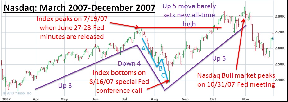
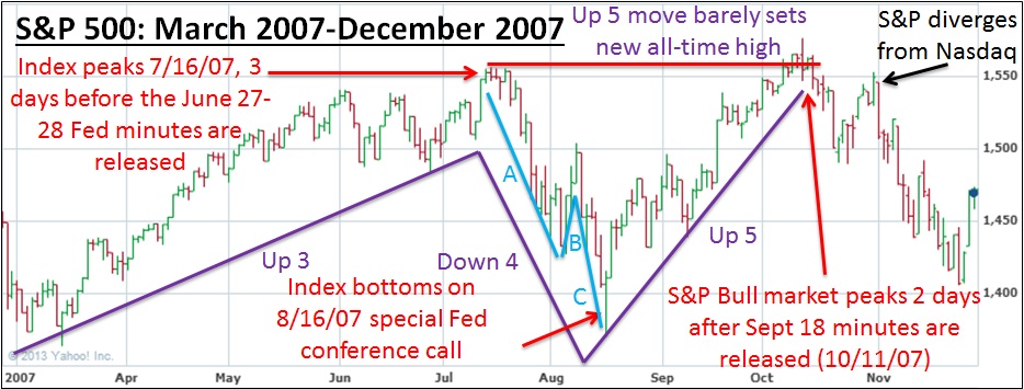
Also interesting is that the Nasdaq chart above does not line up exactly with the S&P500 chart, whichh I’ve marked up below. You’ll notice that the indexes tend to diverge at key turning points, which is exactly in-line with my repeated statements that any divergence is key and must be noted. The big divergence was when the S&P500 hit its 2007 bull market peak on October 11th (Fed minutes release), while the Nasdaq hit its bull market peak on October 31st (FOMC meeting). You’ll notice a clear A-B-C as part of Down 4, and a brief correction before Up 5 made a new bull market high.
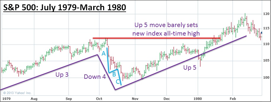
To drive home the points made above, below I’ve included another famous Down 4, Up 5 precedent from 1979-80. The key factors are all there: an A-B-C downward move as part of Wave Down 4, an Up 5 move that has a brief correction before making new bull market highs (not marked on the chart), and an Up 5 move that barely makes new bull market highs before starting into a larger correction. The correction that followed the February 1980 peak was better than 21% deep in only 6 weeks of selling. As you’ve seen from the 3 examples here, an Elliott Wave Down 4 move often comes fast and tends to be very sharp.
In summary, it’s likely we’ll see some similar characteristics in our current market when a Down 4 move eventually emerges (i.e. when tapering finally starts). Whether that happens this month, next month or even the month after is anyone’s guess. The key to the analysis above is being able to make an interpretation of approximately where the market is within its cycle, and to utilize that information to help you gauge the amount of risk you are willing to assume (very limited risk right now). The wave patterns discussed above can be broken down into smaller 5-wave patterns to help further interpret market action; just look at the period from 10/30-11/7 this year– a very clear Down 4 pattern with clear A-B-C, followed by an Up 5 pattern lasting through Black Friday, 11/29).
While we still feel very confident that the start of a 10-15% correction is not too far off (within 0-3 months), we need to remain consistent with the market’s behavior and take opportunities on the long side while they continue to present themselves. The FOMC already stated in its minutes that the initial tapering could begin in the coming months, and we almost expect the market to start selling off in advance of that news. Once the news is official, you can be sure we’ll be near the bottom of Elliott Wave Down 4, getting ready to start a strong Up 5 pattern. Until that time, remain cautious and remember to only utilize this type of analysis to help guide your thinking, not your action.
Conclusion
In summary, November proved to be another strong month for the indexes and a weak month for most leading stocks. While many divergences have emerged across the indicators we follow, the technical action of the markets still indicates we adhere to a long-bias. Several stocks have now traced solid technical patterns and could be positioned for gains in coming months. Time will tell if any of these stocks are able to break out and move higher, and whether our core 5 leaders will resume their absolute leadership of the markets.
As we enter December and the holiday seasons come upon us, remember that the almighty Federal Reserve will meet the week before Christmas, and could finally change its stance and reduce the temporary stimulus it’s injecting into financial markets. As quoted last month, Kopin Tan from Barron’s reminds us that “A gentlemen always opens the door for a lady,” and while naysayers abound, even Chairman Bernanke wants to make his successor’s transition as smooth as possible.
In December, we’ll receive plenty of economic information to fuel speculation about what the Fed may do in coming meetings. Perhaps the sun’s polarity flip will cause the market to go haywire (it has before– search on YouTube for ‘Sun Polarity Flip’). Either way, we’re excited to follow along closely as we close out our first full calendar year in operation. Regardless of what market environment 2014 brings, we’ll continue doing what we love most: relentlessly pursuing all manner of information that could influence markets, and using that information to help us select the best securities that we feel are positioned for growth.
Thomas and I wish you and yours a wonderful holiday season and a very merry Christmas to all. We’ll be back next month with a wrap on what’s likely to be one of the best stock market years in our lifetimes.