Economic data in December was extremely favorable towards a burgeoning U.S. recovery: November non-farm payrolls came in at +200K versus expectations for +185K, the unemployment rate fell to 7% versus expectations for 7.2%, and Q3 GDP was revised up to 4.1% from the previous estimate of 3.6% (and up from the initial November estimate of 2.8%). The economic recovery continues to gain steam. The question now is whether the Fed will be late in recognizing just how rosy the overall business climate is starting to look. The Fed misjudged the strength of the economy in 1987, and we all know how that ended. And 1994 was another example in which the Fed surprised the market, sparking an intense correction.
Many stocks emerged from constructive patterns in December. We counted about 16 breakouts to new highs among the strong growth-type plays in which we invest. I’ll profile some of those stocks below, including the social networking hot potato known as Twitter (TWTR). By definition, TWTR is a leading stock and its explosive price action warrants some investment dollars. That said, like every leader, the stock isn’t without flaws. We’ll dig into TWTR in the Leading Stock section below and give you some insight of how to handle the volatility associated with this security. The action of leading stocks largely indicates that this bull move could have some legs left. Given that many new leaders broke out of early stage patterns, another 6-9 months could remain in this bull move before a larger market top is reached (that’s not to say we won’t experience a few bumps between now and then).
This month we’ll break our market analysis down into our usual 4 pillars of market health: 1) The action of the indexes, 2) The action of the best leading stocks, 3) Sentiment & Psychology-based indicators, and 4) Historical precedent action. Remember that Thomas and I place the most weight on pillars 1 and 2 (our primary measures of market health) when performing our analysis. Pillars 3 and 4 are important, but are secondary indicators in nature and need to be treated as such.
I’m going to dive right into analysis under the assumption that readers of this commentary have read our previous installments and have developed a basic understanding of our approach to the market. For first time readers, I recommend reviewing our February 2013 Commentary and earlier to ascertain a detailed explanation of why we at Satellite Capital examine what we do, and why we are interested in certain stocks over others. And as always, please don’t hesitate to contact Thomas or myself with any questions.
Indexes
For the month of December, the Nasdaq rose 2.8% and the S&P 500 climbed 2.3%. This marks the 4th straight higher monthly close for both indexes, and 10 out of 12 months in 2013 with higher closes. The Nasdaq is now only 18% below its March 2000 high. Similarly, the S&P 500 is 17% above its prior bull market high of 1576. The Nasdaq and the S&P 500 offered few hints of heavy selling towards the end of the month, as is often the case in the lighter-volume trading typical of nearly every December.
One index that received little fanfare in December was the NYSE composite. In the last days of December, the NYSE finally broke into new, all-time high ground by clearing its October 2007 peak of 10,387 (having entered new bull market high ground the month prior). The NYSE and the Nasdaq are the broadest indexes available and Thomas and I study the action of both very closely.
You might recall my comment in our October commentary that the NYSE reaching a new all-time high could signal a fairly sizeable correction, as it has in prior periods of market history (see October 1979 and February 1980 in relation to the January 1973 then all-time high). After briefly piercing into new all-time highs in February 1980, the indexes executed a nose dive that brought the NYSE right back below that prior resistance area. While this is merely an observation of market behavior at a prior point in history similar to that of today, the similarity is increasingly relevant, as the index was again the last of the major indexes to enter new all-time high ground.
Meanwhile, the Russell 2000 has begun to flatten out after its post-Fed meeting surge into the year’s close. While the index price has moved to new all-time highs, its relative strength line (RS) has been diverging from the index price since early October 2013, and has not reached new highs since that time. A brief chart review takes us to late 2009, when the Russell marked new index price highs ahead of the January-February 2010 10.6% index correction. During this period, the Russell’s RS line started diverging from its price in late September, a signal that small cap strength was weakening, again well ahead of an actual correction. Market corrections typically start with small caps weakening, followed by mid-caps, and lastly large caps crumbling under the weight of the indexes. In true market corrections, all correlations go to almost 1 and everything falls in unison, regardless of how good a company is.
As mentioned last month, a January/February 2014 selloff could cut the Russell to somewhere in the neighborhood of 850-950 (based on various tools we use to estimate potential index action). Further evidence is needed before any downside assessment can be reached. The similarities of the two periods in questions are quite striking, and the index price/RS action is indicative of underlying weakness for a broad basket of small cap stocks. We’ll let the action of the indexes dictate how we allocate our investments and assume risk into the New Year.
In summary, the indexes had an amazing run in 2013 and are still looking strong. Despite the current exhibition of strength, accompanying risk is slowly creeping higher with every passing day. Aggressively protecting or neutralizing your downside on positions into early 2014 will be key to starting the year off right. Market trends can often continue further longer than we want or hope they will, so we need to process evidence as it emerges and use that to help us allocate our portfolios.
Leading Stocks
December was an excellent month for a fresh crop of leading stocks. As a rally ages (including our current bull rally), the only way the market can power higher is for a fresh crop of new leaders from a wide array of industry groups to make significant upside progress. Last month was an exhibition of such action, with plentiful breakouts to fresh highs across many different industry groups. Recall that we consider a ‘leading stock’ to be one with the strongest fundamentals (big earnings growth, sales growth, return on equity, cash flows, etc) and an equally impressive technical picture (strong prior uptrends, rising on increasing volume and falling on decreasing volume, etc). We also look for a disruptive driver at the companies we follow, such as LinkedIn and disruption of the professional identity market, or Tesla and the entirely electric car.
A few stocks that broke out in December and exhibit the type of leadership qualities we watch for include (in alphabetical order): ARMH, BIDU, DRYS, DDD, FB, HLF, IACI, LVS, PANW, PCP, PII, TW, TWTR, UA, YNDX, and X. Recall the list I offered last month of stocks to watch: PII, TW, UA, LVS, PANW, and YNDX. The first breakout among this group was on 12/4/13 (LVS), while the latest breakout was on 12/23/13 (YNDX).
When stocks break out in above-average volume (all breakouts mentioned above traded in volume 40% above their daily average), it’s generally wise to try and hold for 8 weeks to allow the stock time to move sufficiently. Obviously if the stock turns south, it’s best to cut your loss quickly, but in almost all cases, holding a stock for the complete 8 weeks is a good way to get past a shakeout (usually 2-6 weeks after the initial breakout) and to realize gains of 15-20% or more. Taken as a 40-day count from the last breakout on 12/23/13, 40 market days later is 2/19/14.
For those of you looking ahead to next year, the Fed meets on Jan 28-29th, and those minutes will be released on Wednesday, 2/19/14 (the exact day our last 40-day holding period expires). The timing is oddly similar to a precedent from 2010-2011, when ARMH and several other stocks broke out on 12/21/10 and hit their 40 market-day threshold by 2/16/11. The Fed minutes were subsequently released on 2/18/11, marking a change in trend as the broader market sold off for a straight month to the 3/16/11 low (the Nasdaq fell 8.3% during this period).
As you may know from other sections in this commentary and previous commentaries, Thomas and I have been stalking a 10-15% intermediate correction (part of our 2014 investment roadmap), and now believe the timing of that correction to fall from approximately 2/19/14 to 3/19/14 (20 market days from January’s Fed minutes release to March’s Fed meeting day). As new information comes, we’ll adjust accordingly, but we feel fairly comfortable with this proposed timing. We’ll delve into this roadmap more in the Sentiment & Psychology and History & Precedent sections below.
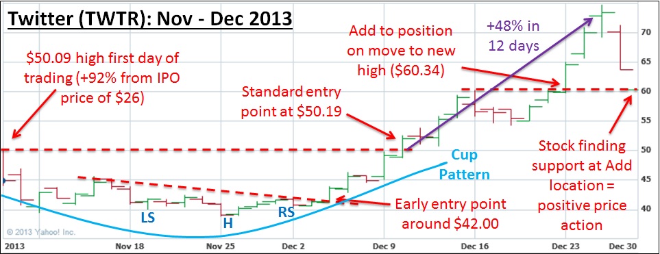
We can’t end the discussion of leading stocks this month without a brief mention of the extremely powerful action exhibited by social media and recent IPO darling Twitter (TWTR). TWTR came public on November 7th at $26, ran up to $50.09 (+92.6%) in its first day of trading, and then promptly corrected to $38.80 (-22.5%) over a 3-week period. Notice that you could say the stock had a very strong prior uptrend (remember the high, tight flag we were talking about: +100% or so in <8 weeks before consolidating and exploding higher?) followed by a shallow IPO correction.
On 12/10/13, the stock broke out and quickly rose 20% in only 5 trading days. When a stock exhibits that kind of power, we have a rule that the stock must be held for a full 8 weeks before determining what to do next. This 8-week hold rule helps keep you in a stock when violent shakeouts occur, as was the case on 12/27/13 and 12/28/13. 40 days of trading for TWTR is 2/6/14, which is about two weeks before the Fed minutes are released.
After such a steep rise (TWTR ran +48.8% in 12 days from its breakout price of $50.19 to a high of $74.73), it’s not uncommon to see a sharp selloff to shake out weak stock holders, often due to a downgrade or some other news. On 12/27, TWTR fell just over 13% in a single day on an analyst downgrade. The stock then dropped another 5.1% the following day, for a total selloff of 21.6%. Recall the 2010 ARMH breakout mentioned above. ARMH ran up about 45% in 17 days, and then experienced a violent one-week correction that sent the stock south by 14%. Such action is common among top winning stocks throughout history. Syntex, an early manufacturer of the birth control pill, exhibited very similar behavior in 1963 following a 500% breakout from an early-stage pattern, not unlike that of TWTR.
One glaring flaw of TWTR I have yet to mention is its complete lack of earnings. While we obviously don’t prefer that the stock has no earnings and has yet to be profitable, sometimes you must be flexible and realize not every stock is going to fulfill every criteria on which you grade. Maintaining tight stop losses on stocks like TWTR is of paramount importance to mounting a solid defense in the case something goes awry. For now, TWTR is behaving exactly as we’d expect a leader to behave, and its price action warrants some investment dollars. We’ll follow this story closely over the next 6-12 months, as the stock is likely just heating up (first stage pattern breakout, suggesting significant runway left before a top later this year).
Overall, with new leaders emerging from early stage patterns, it’s entirely plausible that this leg of the bull market could persist another 6-9 months before ultimately topping. Given where we are in the cycle, this is likely the last leadership rotation possible before a major market top in late Q3 or early Q4 next year. How you handle these stocks now could be key to how well positioned you are after any potential selloffs early next year (possibly mid-late Q1 2014, as mentioned above).
We remain committed to the long side of the market for now, and will only look to short the indexes in the event that sufficient evidence confirms our envisioned 10-15% broader market decline is nigh. We will likely hold any stocks with truly exceptional gains through the correction, but plan to take most profits at 20-25%. Harvesting gains is key to realizing a continually rising equity curve, and we recommend holding only the best of the best merchandise through a market decline. The action of indexes and stocks together indicates January could be a little choppy, but the aforementioned leaders should be able to make upside progress into at least the middle of February.
Sentiment & Psychology
“Given everything discussed above, where does that leave us in our current market environment? When exactly will tapering start? The short answer is we don’t know for sure, but a market selloff in advance of the taper announcement is likely. And then, as we saw above, a market bottom should theoretically happen the day of or shortly thereafter the announcement, and the indexes should be off like rockets to higher ground. The psychology behind this is that the news is always worst at the bottom, because many institutional investors have foreseen what was going to happen before it happened. Then, when the event happens, the selling pressure finally evaporates and the market is again free to move higher.”
The quoted paragraph above is displayed exactly as I typed it in our November market commentary from last month. Indeed, the market sold off from the 11/29/13 Black Friday peak through the Wednesday 12/18/13 Fed meeting, when the all-feared taper was announced (a reduction of only $10B per month starting in January, far less severe than expected).
Continuing on last month’s Fed-focused theme, I thought I’d update our 2013 Fed Activity study to demonstrate that I wasn’t simply fitting the data to match my expectations. Below I’ll give the updated Fed activity from the December 17-18th meeting and the resultant market action, then in the History & Precedent section below I’ll show how the Fed action plays into those silly Elliott Waves we keep talking about (it’s interesting, I promise). First, recall that on the chart below I’ve noted the major FOMC activities throughout 2013 (both the dates on which meetings concluded as well as the dates on which minutes were released). I then outlined the market’s discernable move based on the Fed’s action, what date that action started, and how many market days from the Fed’s action did the move commence.
On the table below, the cells highlighted in green represent moves that can clearly be traced to Fed activity and that commenced within 5 days of said activity. Cells in yellow represent moves that could not be traced to Fed activity, or that commenced more than one market week from said activity (5 trading days per week). As you can see below, of 16 instances this year, the 12 green instances represent 75% of the total market shifts. While correlation doesn’t necessarily lead to causation, every astute market observer is aware of the profound effect the Fed has on the economy through the various policy tools it employs.
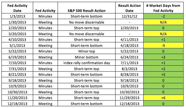
As indicated above, the market sold off through the December Fed meeting when tapering was announced, and began its rebound that very same day (12/18/13). The market enjoyed its typical “Santa rally” through the end of the December, as the indexes galloped higher into the year’s close. We envision this rally lasting through approximately 1/8/14, as outlined below. The Fed-induced trend shifts continued through the end of 2013 and look to be par for the course into early 2014.
On the graph below, I’ve expanded our study to include the relevant upcoming Fed dates from the first portion of 2014. Under the “S&P 500 Result Action” column, I’ve laid out our best educated guess as to how early 2014 is likely to play out. After starting the year strong (for a few trading days), the market will likely shift course after the Fed minutes release and trend lower through the Fed meeting at the end of January. At that point, the indexes should resume their upward march through the middle of February, which we feel will mark an intermediate-term top for the indexes. We then expect the market to sell off for one straight month (about 20 trading days, and a 10-15% price decline) through the Fed’s March meeting. The indexes should then generally press higher over the ensuing 5-6 months through August/September 2014, at which point we’ll mark a major market top. And after said top, we’re modeling a steep drop in the manner of October 1987 (20-40% correction in about two months’ time). Whew. In the interest of staying grounded and keeping things in perspective, it’s worth stopping here to reference our cooldown paragraph at the end of this section.
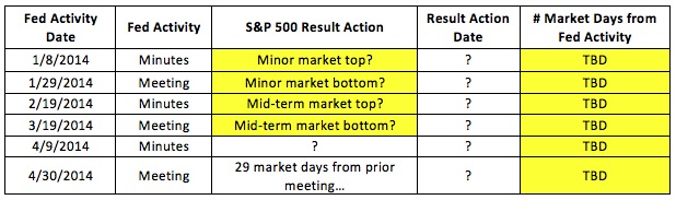
Looking at the psychology of the February to March 2014 selloff, we’ll also posit the following: In our October/November commentary, Thomas and I correctly reasoned that Bernanke would open the door for the lady behind him by initiating QE tapering under his watch. The notion abounds that Janet Yellen is much more dovish than her predecessor (i.e. has an inclination to favor QE-like programs to support the economic recovery) , and will therefore allow QE3 to continue under her watch for longer than she may deem necessary. Some say she will even expand QE after taking over. In our opinion, markets are in for a big surprise once Yellen proves her strict allegiance to data. We find it far more likely that she catches everyone off-guard at her first meeting as Fed chairperson in March by using strong economic data to justify further tapering.
Hence, we feel the January Fed minutes released in February 2014 should indicate the FOMC is weighing a larger round of tapering, at which time the market would sell off through the announcement of said tapering at the following FOMC meeting in March 2014. This should all sound familiar, as it closely mirrors the market’s top in late November 2013 and bottom on the initial tapering announcement at the December 2013 meeting, precisely as we laid out last month.
Aside from our Fed study, there are some interesting things brewing in the land of excessively-bullish sentiment. The Investor’s Intelligence Bulls versus Bears survey has now had a better than 4:1 ratio for the last 5 weeks. The last time this level of excessiveness persisted for a prolonged period was in January/February 1987, and we all know what transpired later that year. The point here is not that the market will crumble under its own weight tomorrow, or even two days from now, but that this secondary indicator is warning us of excess within the system. Such excesses typically take a long time to surface, and 1987 was no exception (8-9 months from the aforementioned excess sentiment readings). Given everything I’ve outlined above, I hope you can see how this sentiment will line up with our roadmap for 2014.
Lastly, verbatim from last month (it still applies and always will): “One final reminder is that sentiment and psychology-based indicators are secondary in nature. The most important action is by far that of the indexes and leading stocks. Both Sentiment & Psychology and History & Precedent can help us work towards a deeper level of understanding of a given market environment, but we need to cement in our minds that they are of secondary importance. While the importance of the Fed cannot be understated, we need to be cognizant that there are many factors at work in the market, and the best we can hope to do is use our dashboard of indicators to guide how much risk we assume in a given market environment. Keep watching how the market responds to the Fed’s statements, press conferences, and meeting minutes over the coming year.“
History & Precedent
As I mentioned above, and in the spirit of rounding out our 2014 roadmap, I’ll now tie our Fed study to our interpretation of Elliott Waves in the current market environment. I’m not going to spend time now detailing how Elliott Wave analysis works (please refer to our November 2013 commentary and prior for a primer), but the basic tenet holds that any major market move higher is comprised of 3 up moves interceded by 2 down moves (Up 1, Down 2, Up 3, Down 4, Up 5). At the end of a 5-wave up cycle, the market shifts into a 3-wave or 5-wave down cycle (Down 1, Up 2, Down 3, Up 4, Down 5) before then moving into another up cycle.
In last month’s November 2013 commentary, I demonstrated via three charts that the ‘Down 4’ action usually consists of 3 shorter waves (Down A, Up B, Down C), tends to hit very quickly, and does a tremendous amount of damage in a short period of time. One other key item to keep in mind is that the larger 5-wave patterns can be broken down into even smaller 5-wave patterns. Think orders of magnitude. On the charts that follow, I’ve used the following color scheme to keep track of the levels of magnitude for our waves: Blue = Major waves, Purple = Intermediate waves, Red = Minor waves, Green = Sub-minor waves, Black = demonstrating A-B-C pattern associated with EVERY Down 4 (regardless of wave scale). If you’re colorblind, please contact us as this will be unpleasant to follow.
If you have questions on anything discussed below, please email Chris or Thomas and we’ll do our best to walk you through how exactly we’re coming to our conclusions. If this analysis feels a bit like hocus pocus or reading tea leaves, you’re not alone. Performing this analysis successfully in real time is very much an art, and not a science. The important thing to remember is that when performed correctly, it holds up incredibly well throughout the entire history of developed domestic markets, dating back to the US Industrial Revolution. We’ll save that demonstration for another day. For now, you’ll just have to take our word on it:
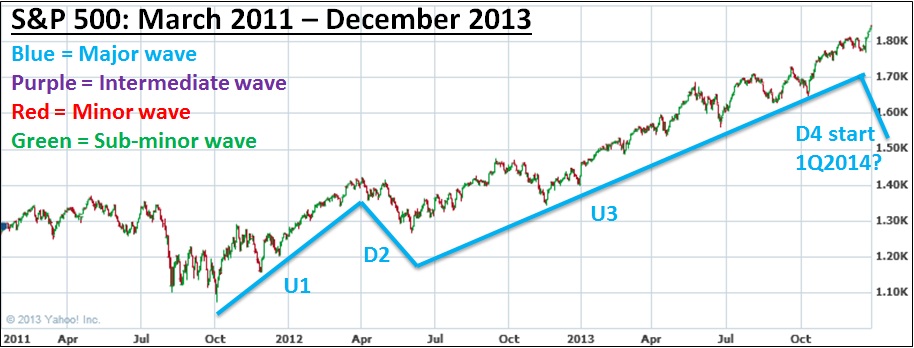
The chart above displays the largest magnitude wave starting in October 2011 and continuing through today. You’ll note that we’re currently in Up 3 and are looking for Down 4 (the 10-15% selloff we’ve been discussing). The Up 5 forthcoming leg would likely last about 6 months (about as long as Up 1), so until around September 2014. After that point, we’ll be into a magnitude of waves one level higher than those discussed here.
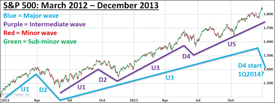
This second chart keeps the Blue Major wave in context, and introduces the Purple Intermediate wave, of which we are currently in Up 5. Upon the completion of Purple Up 5, we will revert to Down 4 of the Blue Major wave. Stay with me.
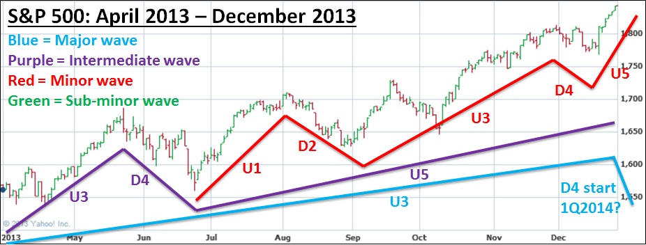
The chart above shows Up 3 for the Blue Major wave, Up 3-Down 4-Up 5 for the Purple Intermediate wave, and the full 5-wave pattern for the Red Minor wave. Note that the Down 4 leg of the Red wave is the Down 4 that bottomed with the Fed’s taper announcement on 12/18/13. Briefly, I want to ensure I harp on the point that selloffs usually happen ahead of the news announcement. The news is worst at the bottom, at which point everyone who wants to sell has already sold.
To reiterate the fact that there is both some science and some art to this field of analysis, the following excerpt is from our commentary last month: “The FOMC already stated in its minutes that the initial tapering could begin in the coming months, and we almost expect the market to start selling off in advance of that news. Once the news is official, you can be sure we’ll be near the bottom of Elliott Wave Down 4, getting ready to start a strong Up 5 pattern.” The above chart reflects a nice manifestation of our prediction, solidified by the power with which the market shot upward into Up 5 on 12/18/2013 (a 1.66% pop for the S&P 500 in 143% above average volume).
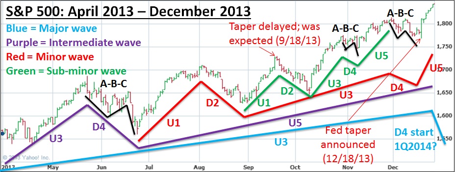
On this last chart, I’ve marked up a magnitude below the Red Minor waves (Green Sub-minor) for your review. I also went back to every Down 4 displayed on the chart to demonstrate in Black the A-B-C nature of this type of leg. We’ll soon be looking for the beginning of Down 4 for the Blue Major wave (the 10-15% selloff), and this larger Down 4 leg should be A-B-C shaped in nature as well, with a likely bottom in March 2014. Also marked on the above chart is when tapering was widely expected to begin in September 2013. The market rallied in earnest for about 3 weeks before it was announced at the September FOMC meeting that tapering would in fact not begin. The market’s foresight here led the indexes higher ahead of the actual news being released. Upon the release of the news, the reverse psychology of the actual taper commencement in December occurred. A bit convoluted perhaps, but think about how it makes sense from an economic standpoint.
Given the research we presented last month, it wouldn’t be uncommon for the S&P 500 and other indexes to diverge from the Nasdaq for a few weeks and likely top out first (see the 2007 precedent discussed last month). For a more recent example, see how the S&P 500 and the NYSE topped on 11/29/13 and bottomed on 12/18/13. The Nasdaq, on the other hand, topped on 12/9/13 and bottomed on 12/18/13 (7 days in duration). The corresponding Nasdaq Elliott Wave Down 2 pattern last summer (Red Minor wave magnitude for those paying attention) lasted 16 days (8/6/13 to 8/27/13). We say ‘corresponding’ because another detail you can get bogged down with (if this wasn’t confusing enough already) is that Down 2 is typically about twice as long in duration as Down 4. To us, 16 days last summer versus 7 days in December is pretty darn close to twice the duration.
To drive this timing home a little further, recall that Alan Greenspan took over as chairman of the Fed on August 11, 1987, and also recall that the S&P 500 hit a major top on August 25, 1987 (exactly 2 weeks later). The market then went into its crisis selloff in October 1987. This month, Ben Bernanke will complete his 8-year reign at the helm of the Fed on January 31, 2014. After which, on the following day, February 1st, Janet Yellen will start her new role as leader of the U.S. Federal Reserve.
If we have a Greenspan-esque moment and the market indeed tops about 2 weeks after Yellen takes over (approximately Monday, February 17th), that would coincide with the release of the Wednesday, February 19th January Fed minutes release discussed above. The market topped the exact month that Greenspan took over in our precedent example. Will Yellen’s entry spark a similar event? We’re leaning towards a resounding “yes” at the moment, but will stay tuned and of course adjust accordingly. Too many indicators are lining up for us to not be at least suspicious that a 10-15% selloff will be ignited in February and continue through March.
Given the action discussed in the Leading Stock section above, the Fed precedent discussed in Sentiment & Psychology, and the Elliott Wave analysis laid out in this section, Thomas and I are fairly confident regarding an intermediate-term market peak in mid-February 2014. We anticipate the acceleration of tapering will become expected upon the February 19th release of January minutes, which will likely coincide with larger Down 4 (our upcoming Blue Major wave 10-15% selloff). December’s taper announcement already coincided with a much smaller Down 4 (Red Minor wave) that lined up nicely with the Down 2 pattern from August 2013 (see the red lines on the last chart above, specifically how Red Minor wave Down 2 now has its corresponding Down 4). Essentially, this means the stage is now set such that when the market hits its peak in the next month or so, the next selloff is overwhelmingly likely to be the significant one we’ve been envisioning.
Until leading stock holding periods end and distribution starts to mount in the market, we assure you we’ll be invested on the long side, holding leading stocks for as long as possible before we’re compelled to begin harvesting profits. The key to the analysis above is being able to make an interpretation of approximately where the market is within its cycle, and to utilize that information to help you gauge the amount of risk you’re willing to assume (a moderate to high level of risk right now). In this sense, our analysis helps us apex the market’s hairpin turns by adjusting our throttle (exposure to risk) accordingly. However, it’s critical to distinguish between what’s actually happening in the markets and what we expect to happen in the future. Remember to only utilize this type of analysis to help guide your thinking, not your action.
Conclusion
In summary, December was another solid month for the indexes as well as nascent leading stocks. Given that most of the new leadership class has broken out of early-stage patterns, our current bull move likely has another 6-10 months to go before topping. While sentiment is approaching excesses not seen in quite some time, we must be cognizant that this can take many months to surface before a correction manifests (8 to 9 months in the 1987 precedent example). The technical action of the market combined with the fundamental and technical action of leading stocks indicates to us that there remains room to run, and money-making opportunities for the astute investor should abound in 2014.
To end with some food for thought and to provide a taste of the research I intend to share next month: 2014 will be a mid-term election year. Next month in the History & Precedent section, I’ll outline how the stock market has fared during mid-term election years throughout history (hint: there’s been a 10% or better selloff in every mid-term election year we examined going back to 1970). This is just another data point that works until it doesn’t, although 100% across 11 instances makes a pretty compelling case regarding how next year could transpire. More on this topic next month.
Lastly, Thomas and I hope you had a happy holiday season and wish you a happy New Year! 2013 was a solid continuation of the bull market that started in 2009, and 2014 is likely to be more of the same (though nowhere near the smooth sailing 2013 was). Happy 2014!